Designer
Hello, I'm Caroline Frausto!
Welcome to a collection of my work! My love for drawing and design is something that I enjoy to blend together. The following projects range from branding to wayfinding systems. Although the end result for each projects was important, the process of creation is highly valuable.


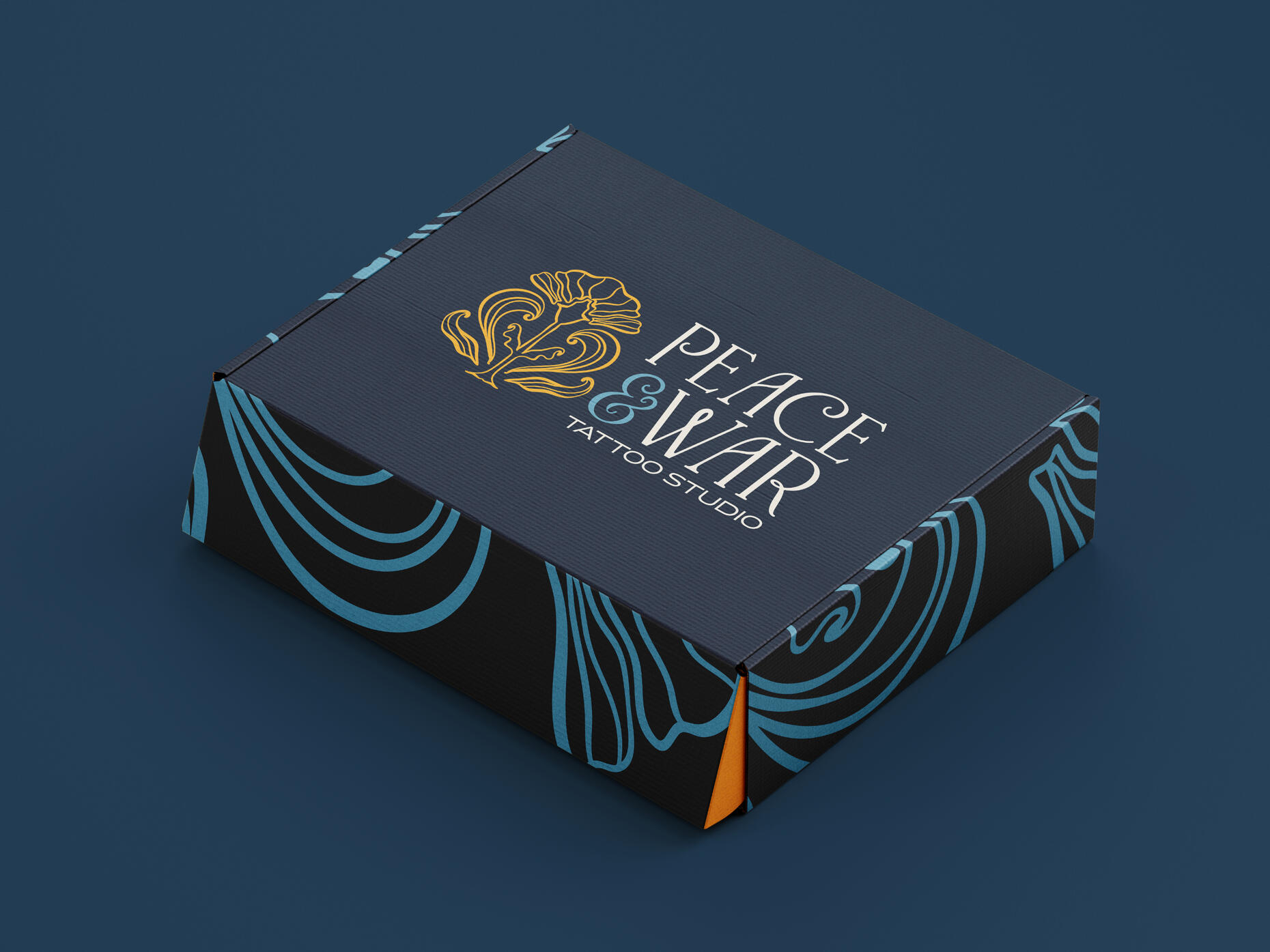
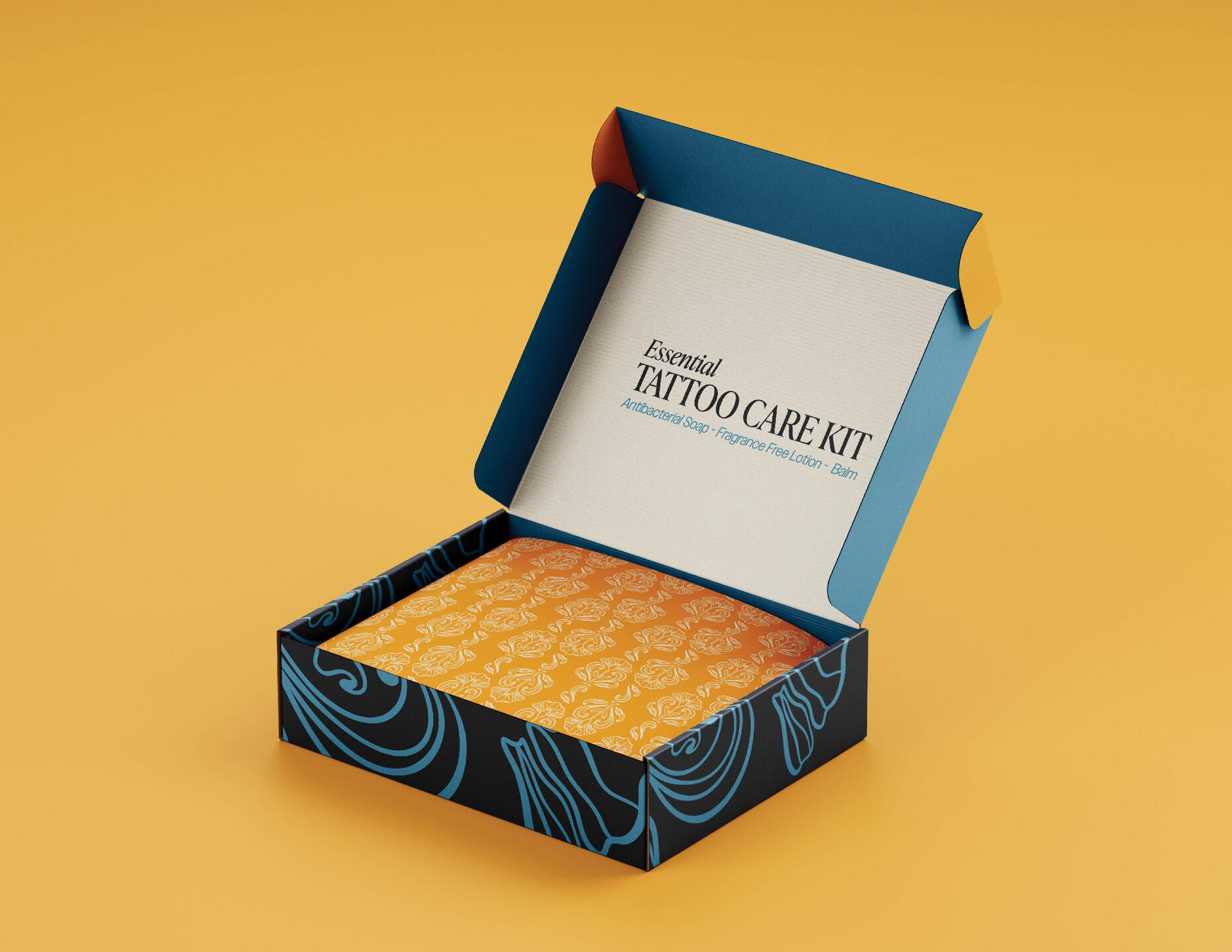
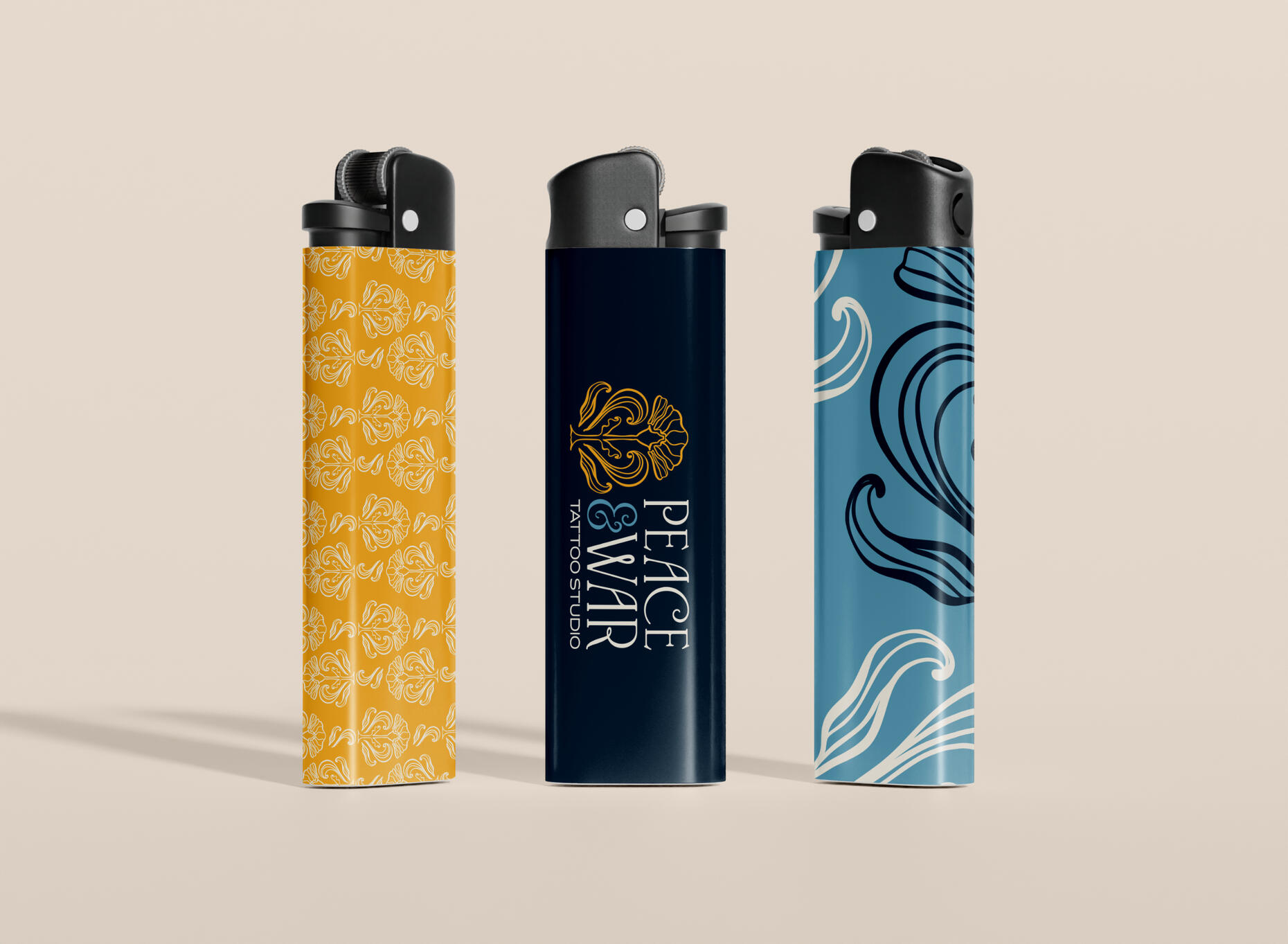
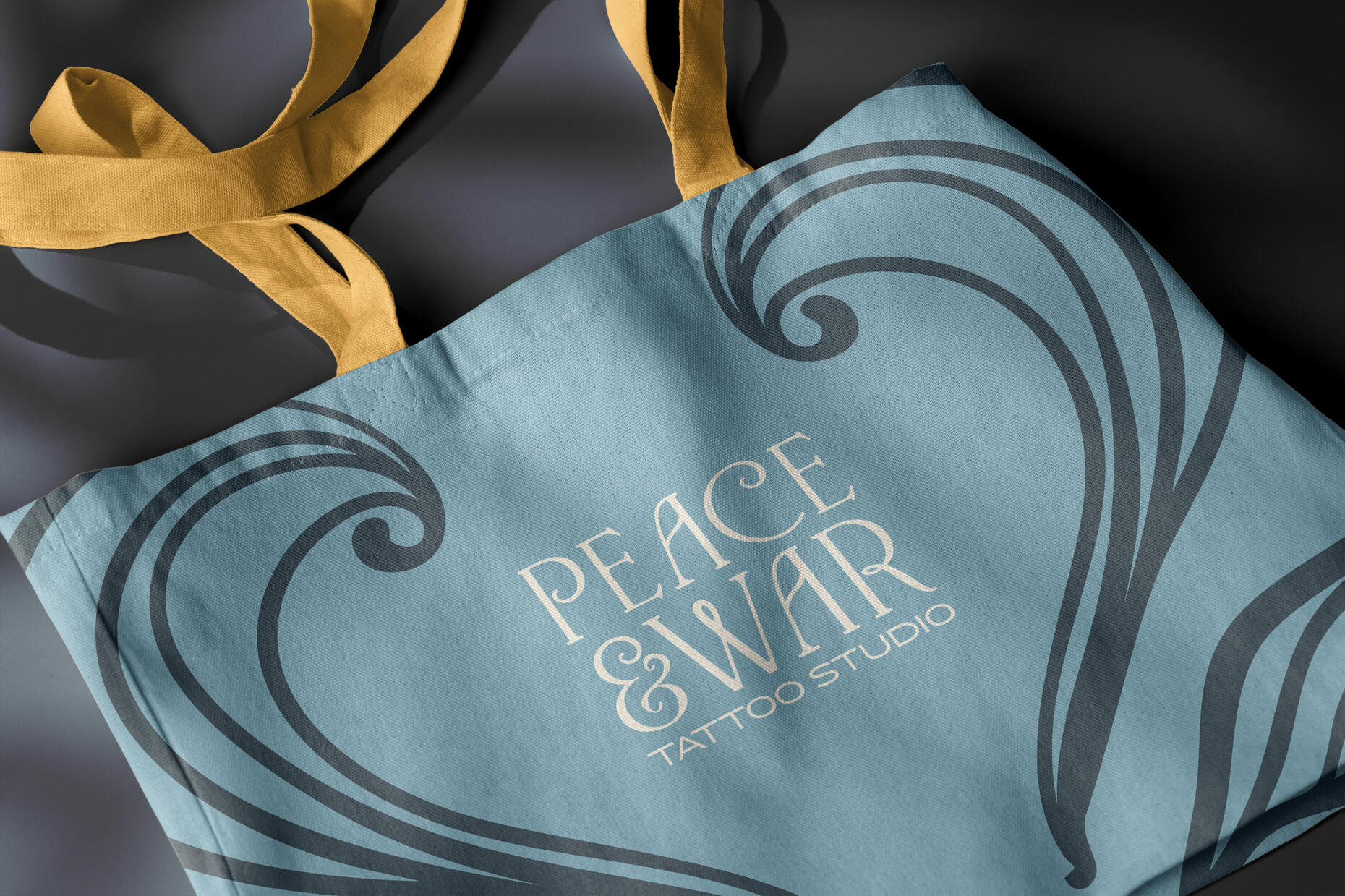
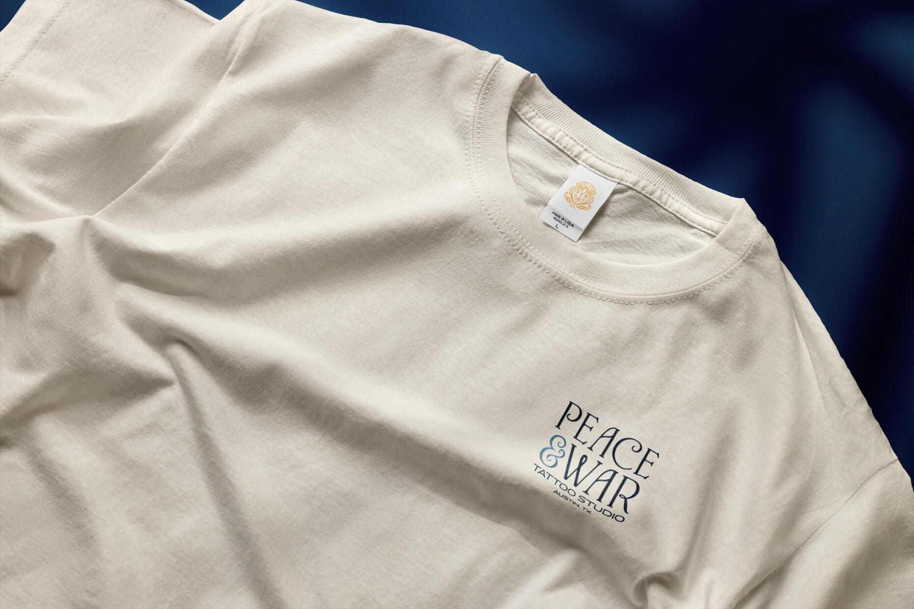
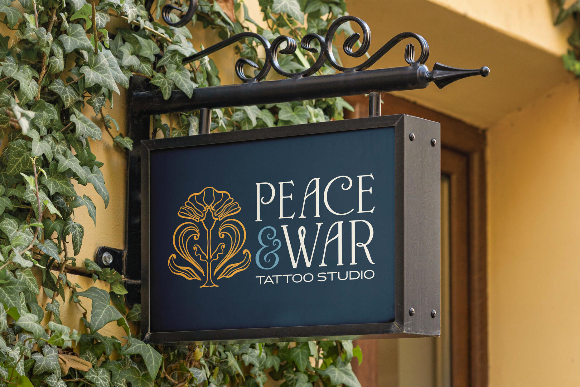
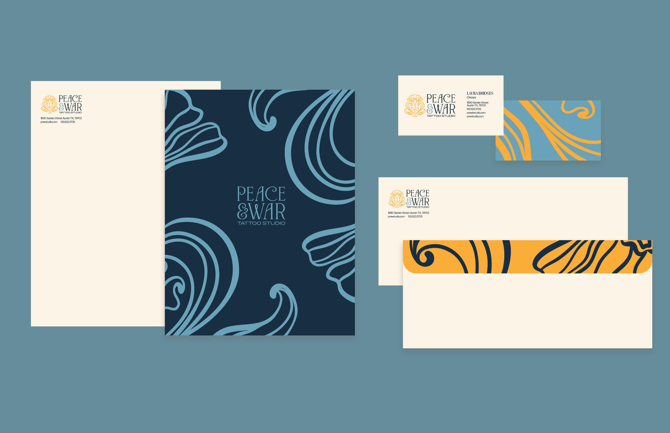
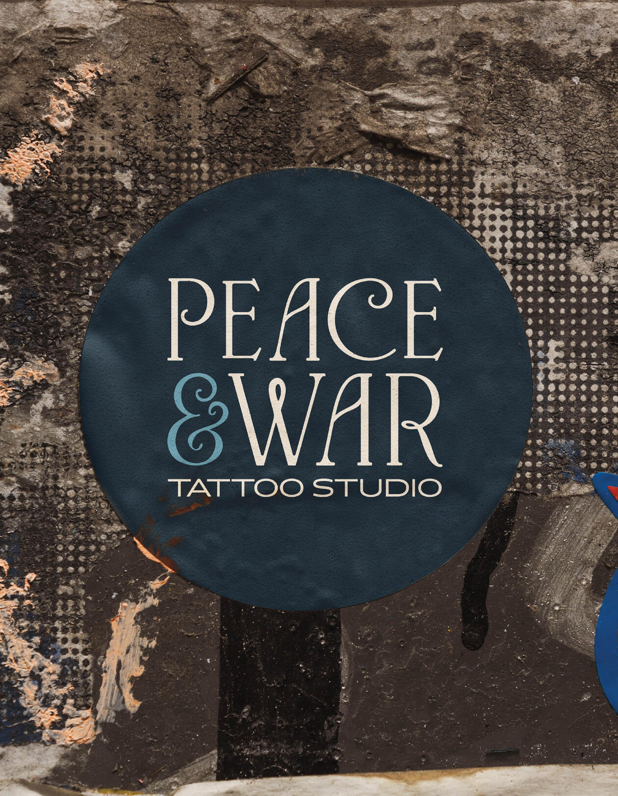
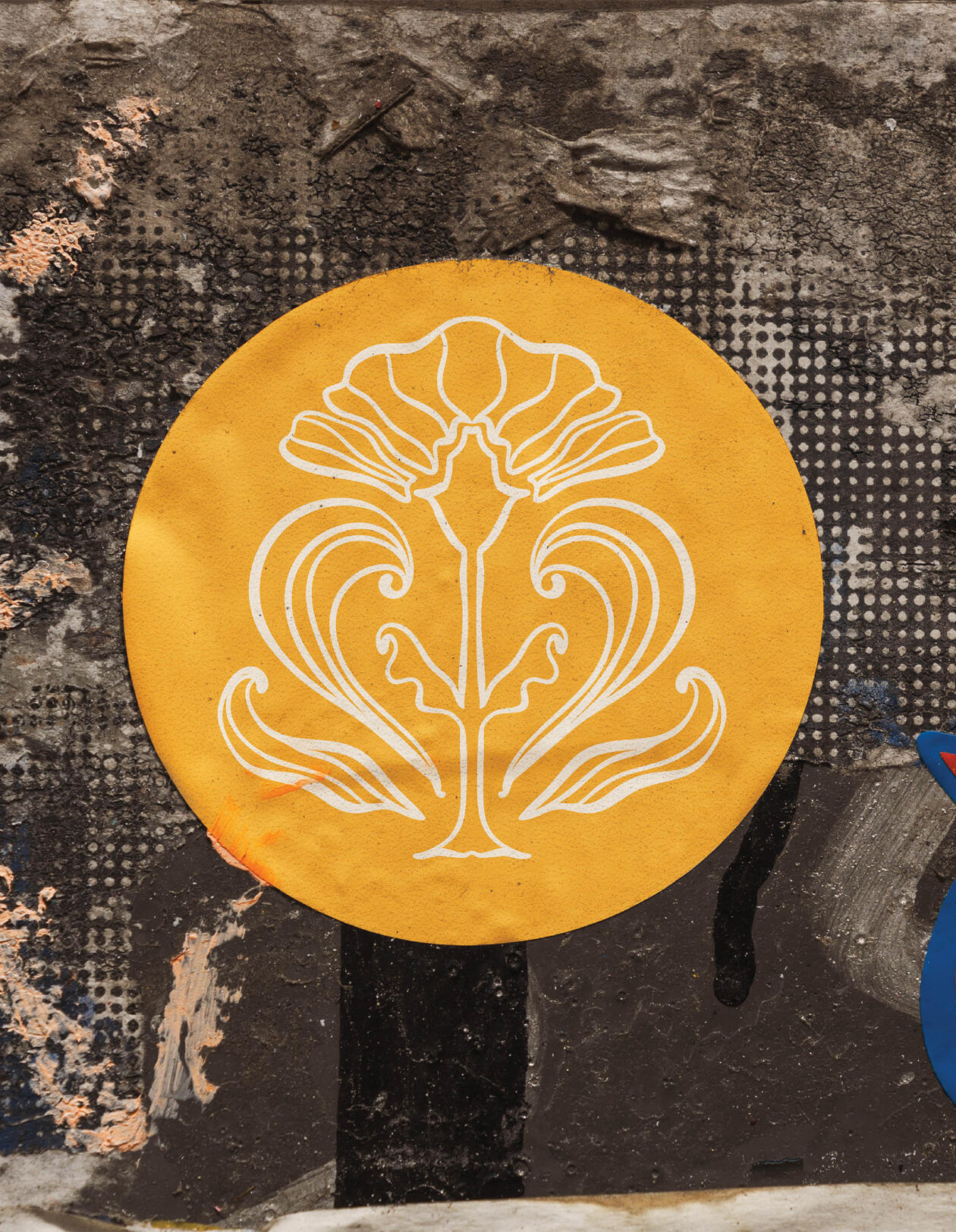
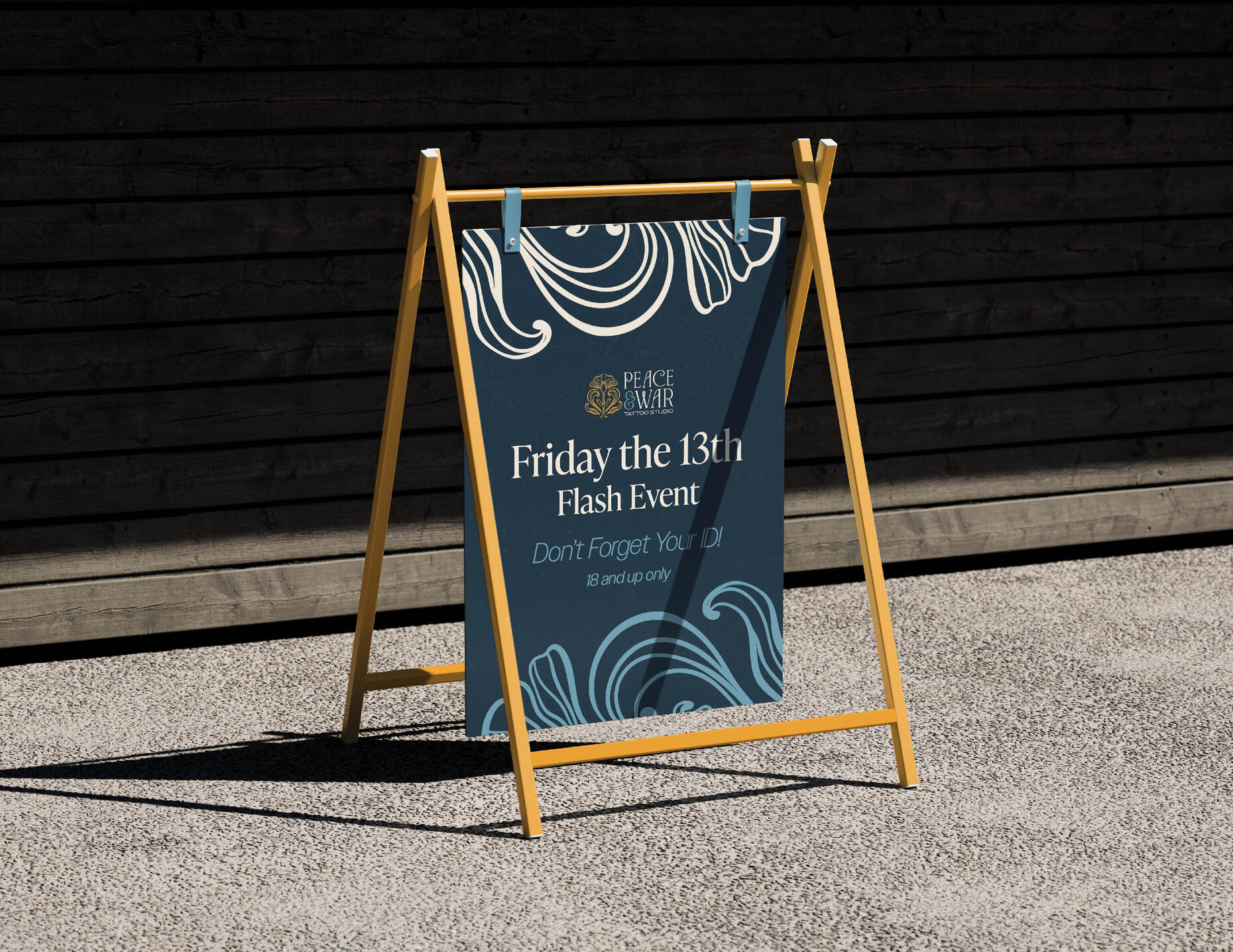
Peace&War Tattoo Studio
Brand Identity
Spring 2025
Based in Austin, TX. Peace&War offers a unique take to tattoos studios.
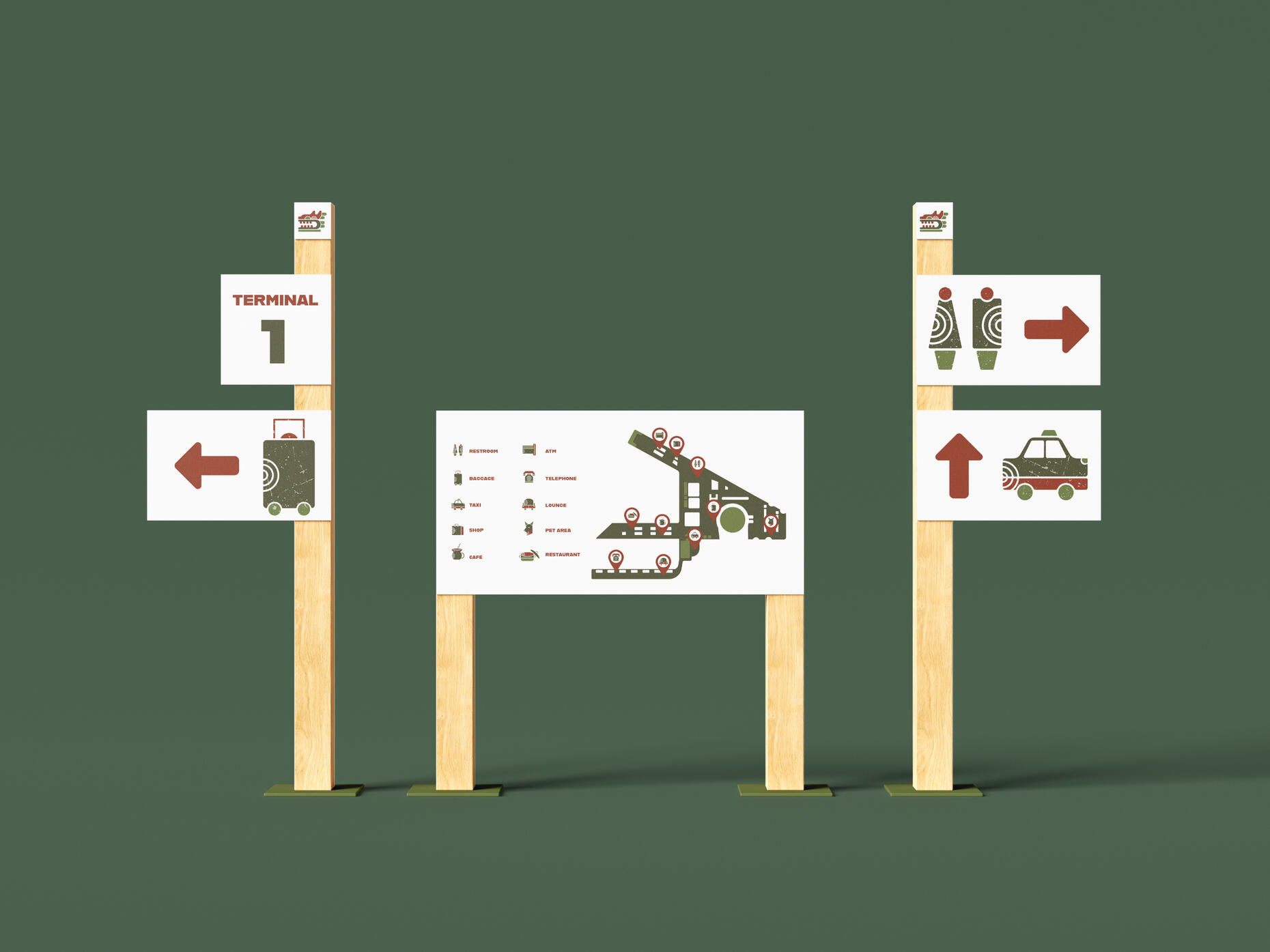
Mexico City Airport
Wayfinding System
Fall 2023
This project consisted of a logo and wayfinding system for an institute.
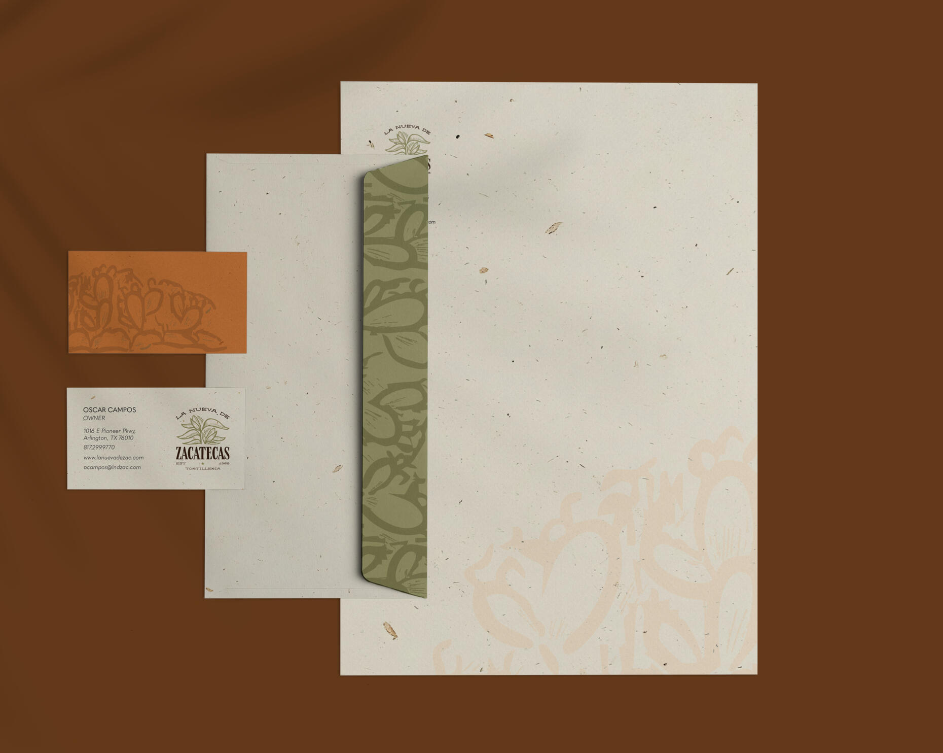
La Nueva de Zacatecas
Logo Redesign
Spring 2025
A redesign for an existing restaurant, includes the redesigned logo, business cards and a stationery set.
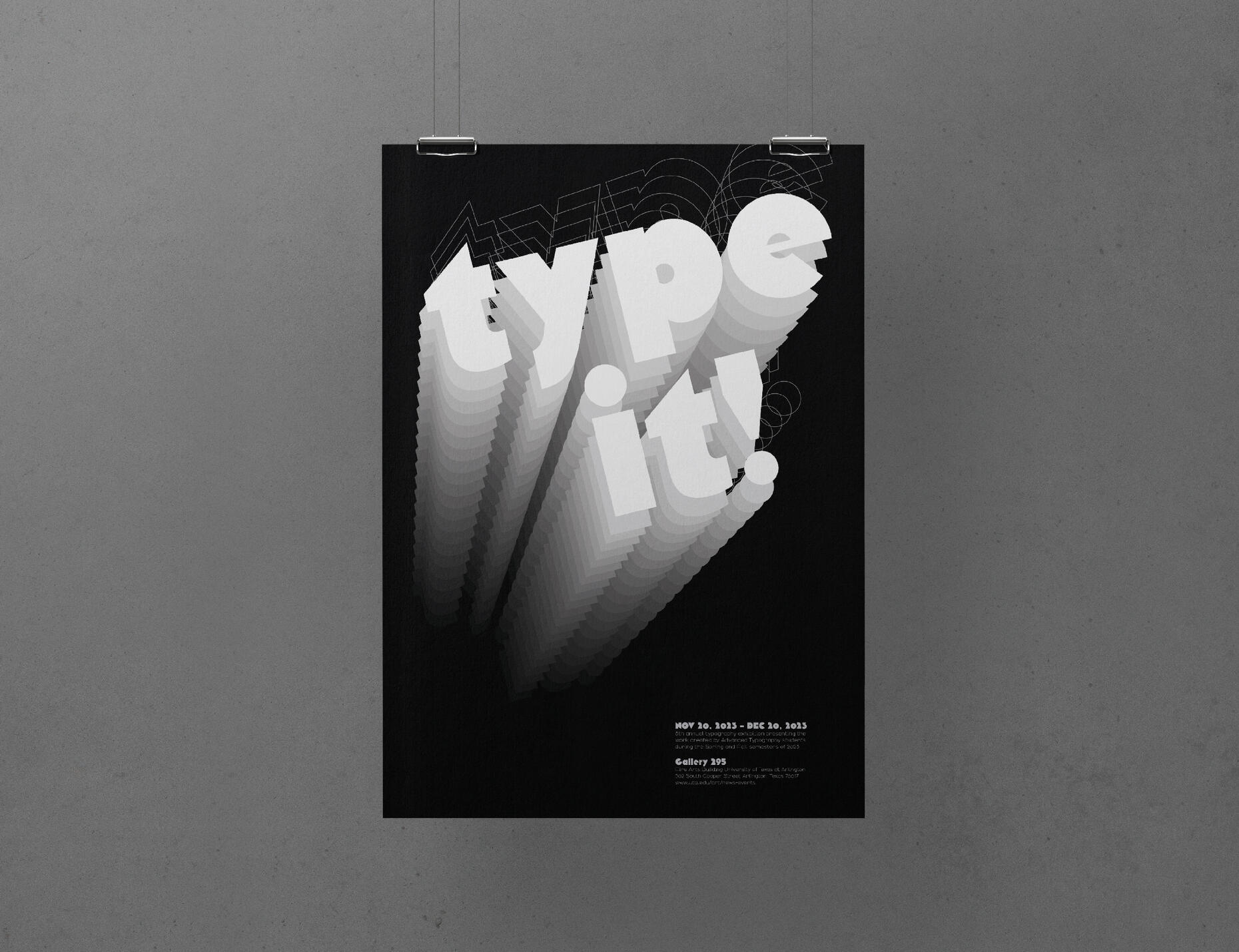
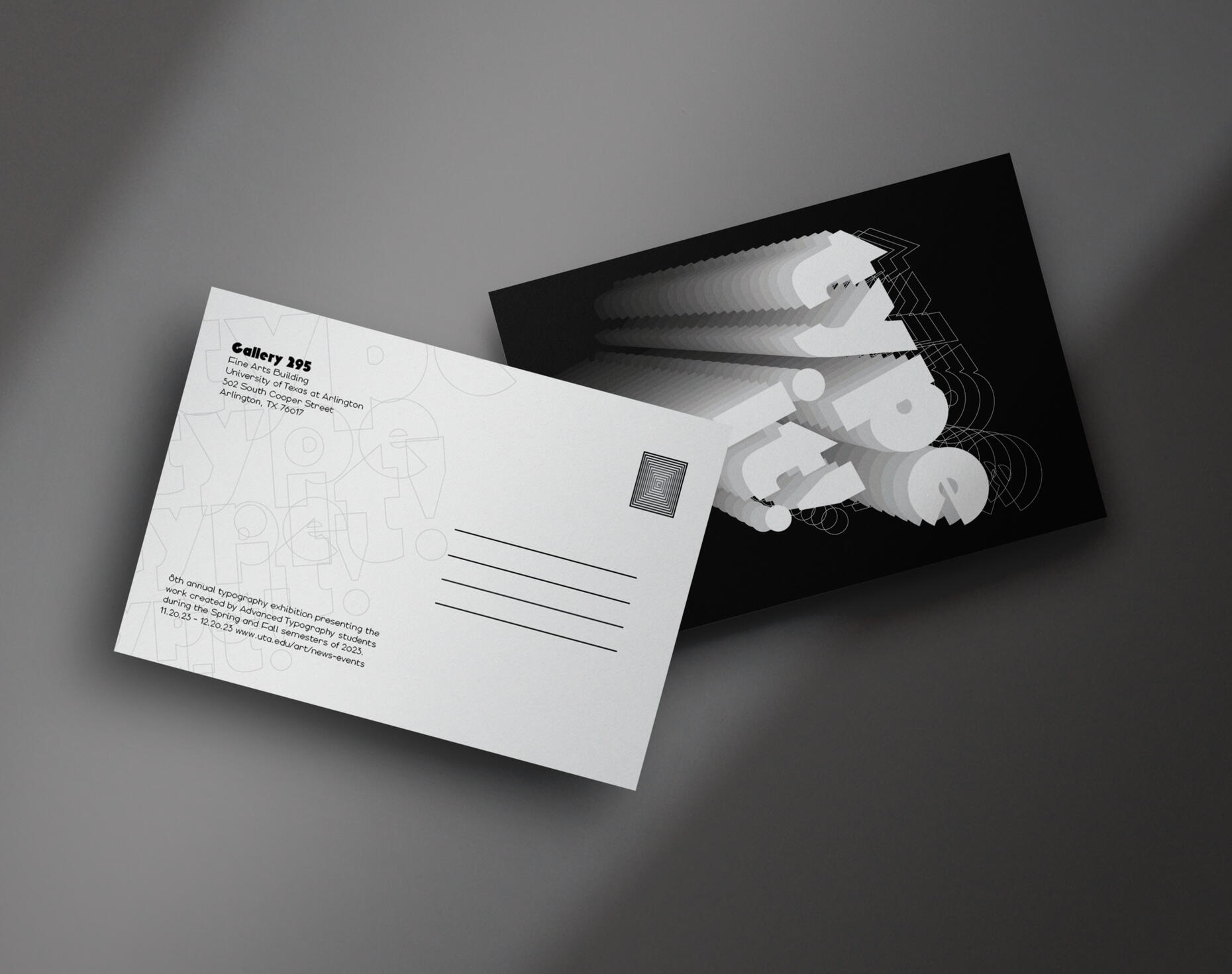
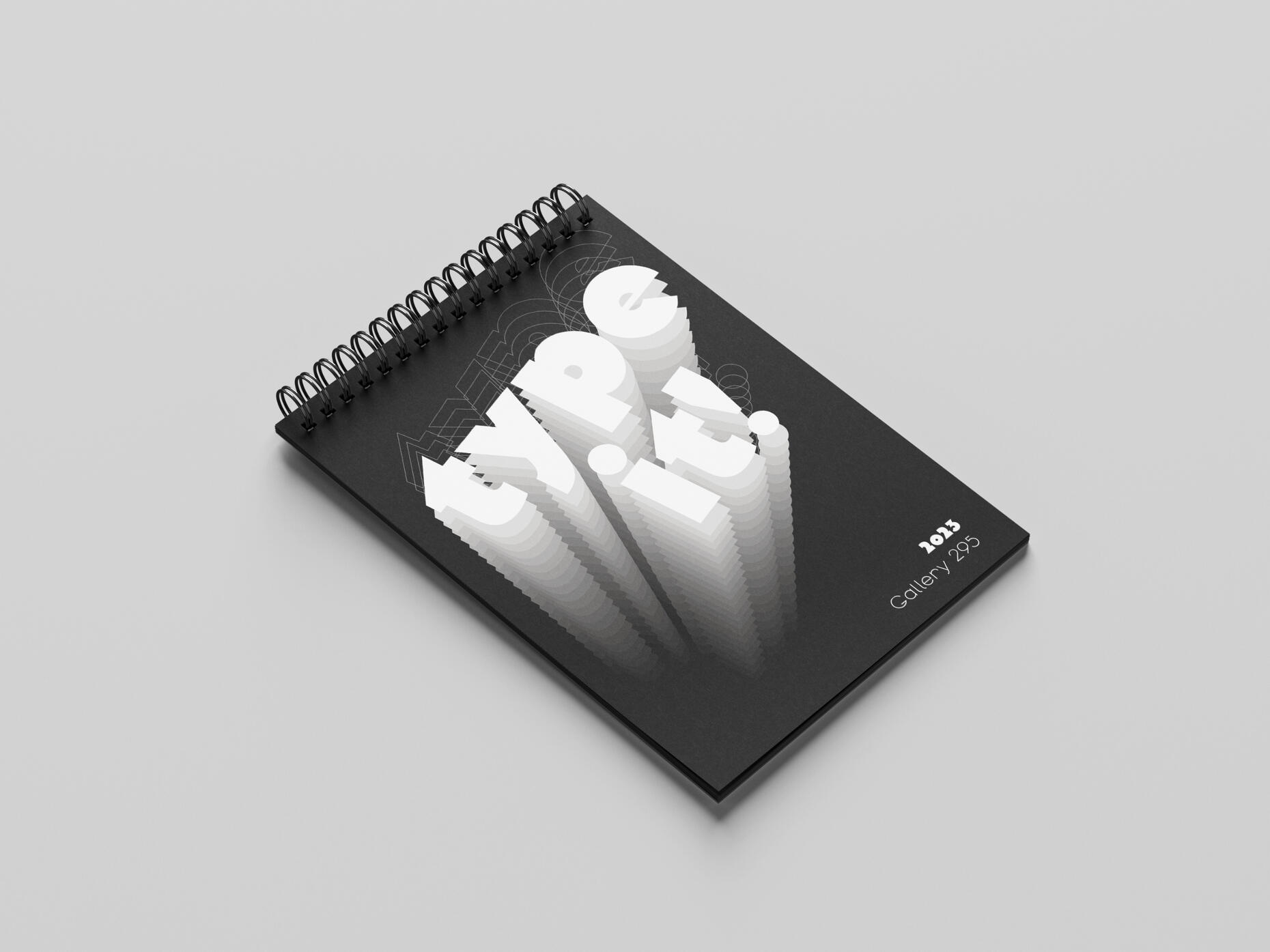
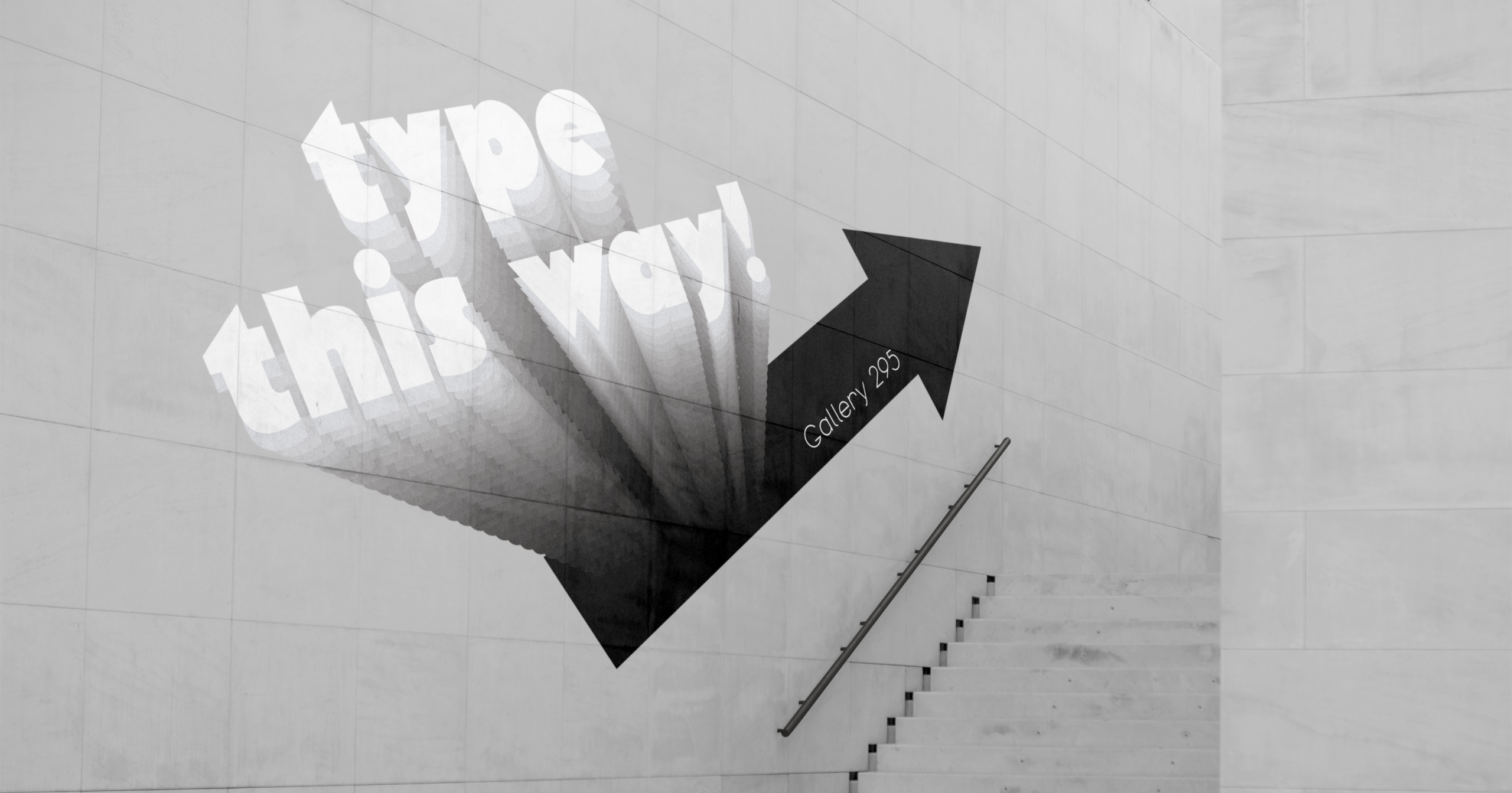
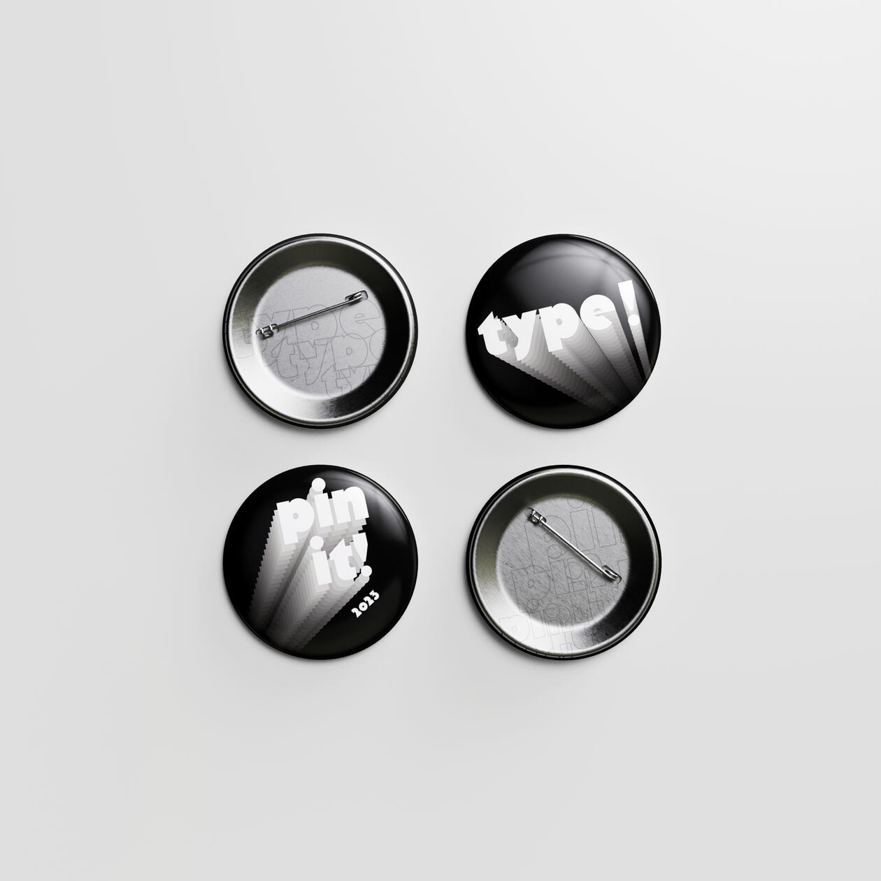
Type It! Exhibition Identity
Fall 2023
An identity for a UTA Type Exhibition. Which included a poster, postcard, and other relating ephemera.
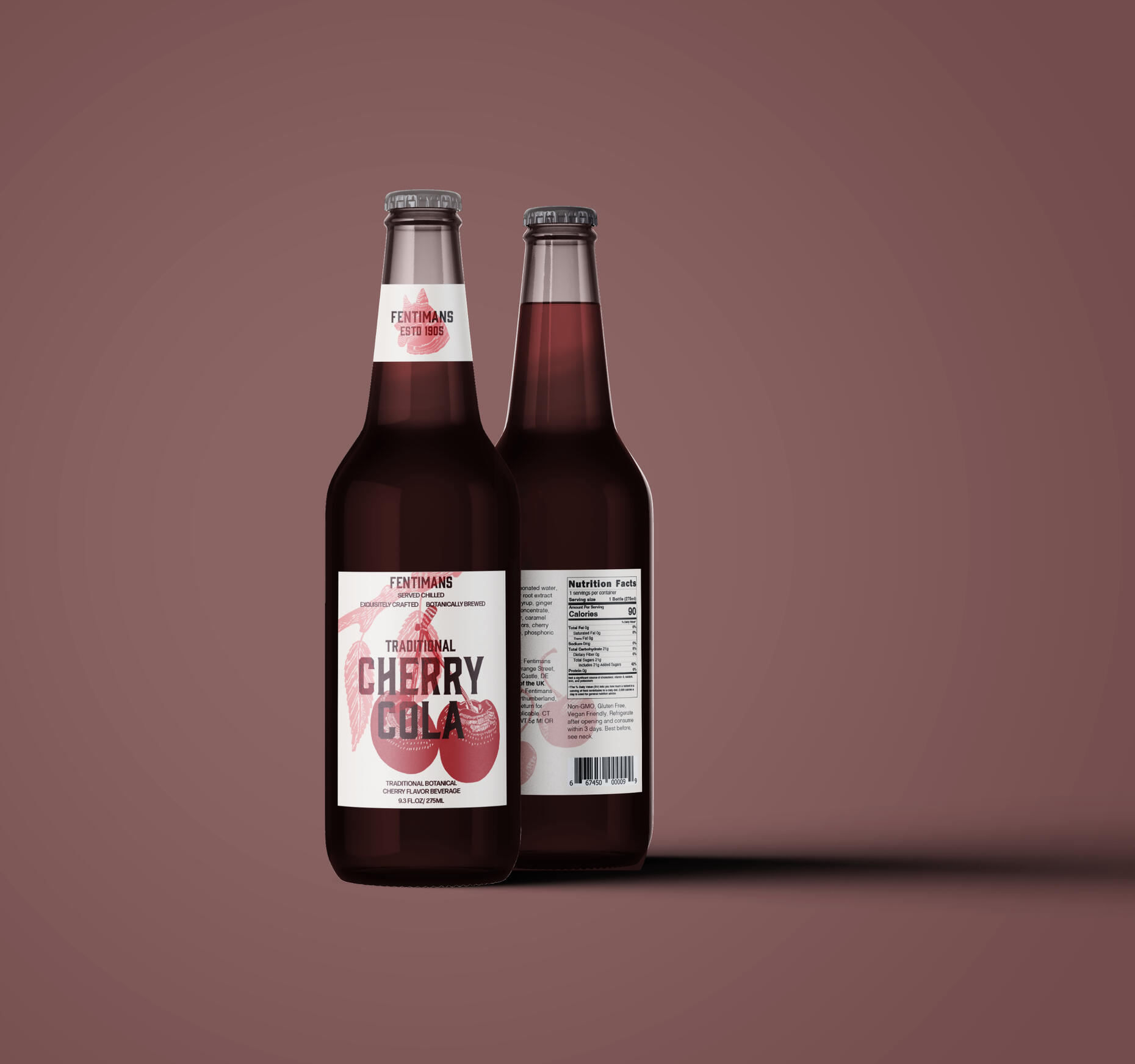
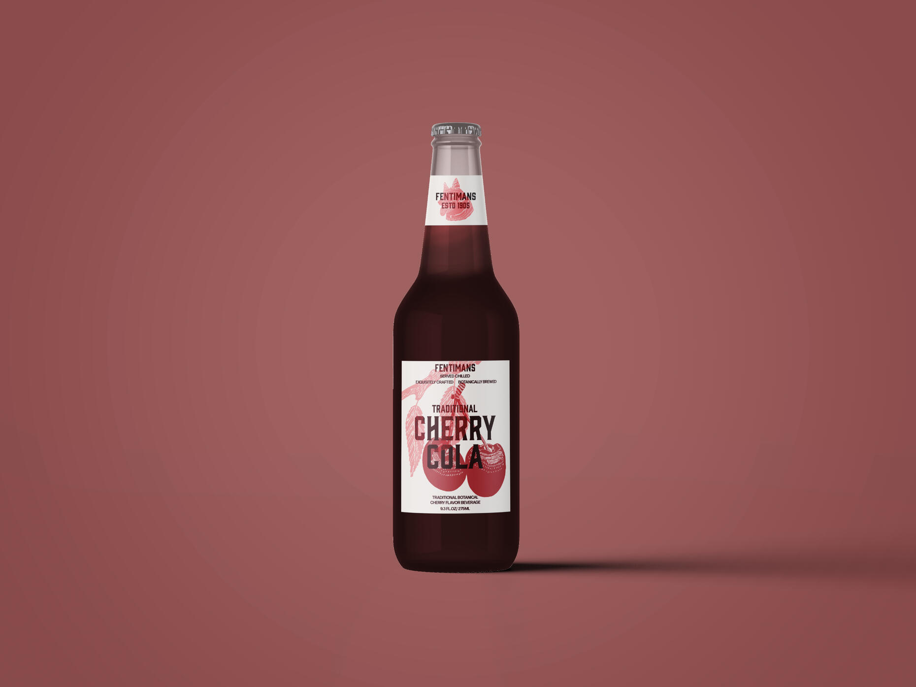
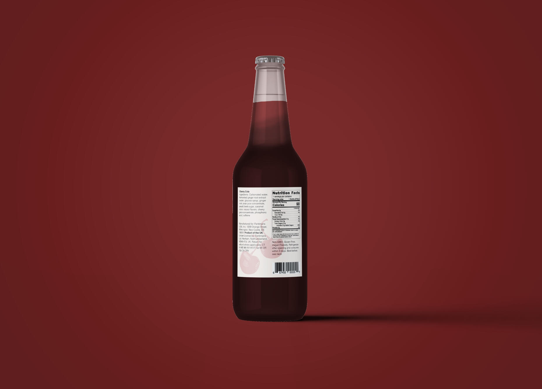
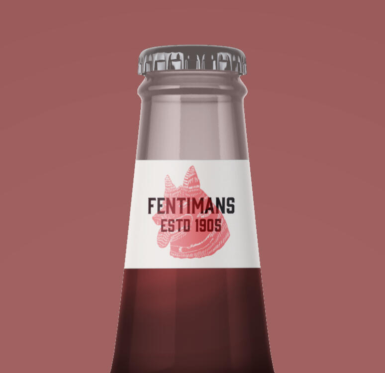
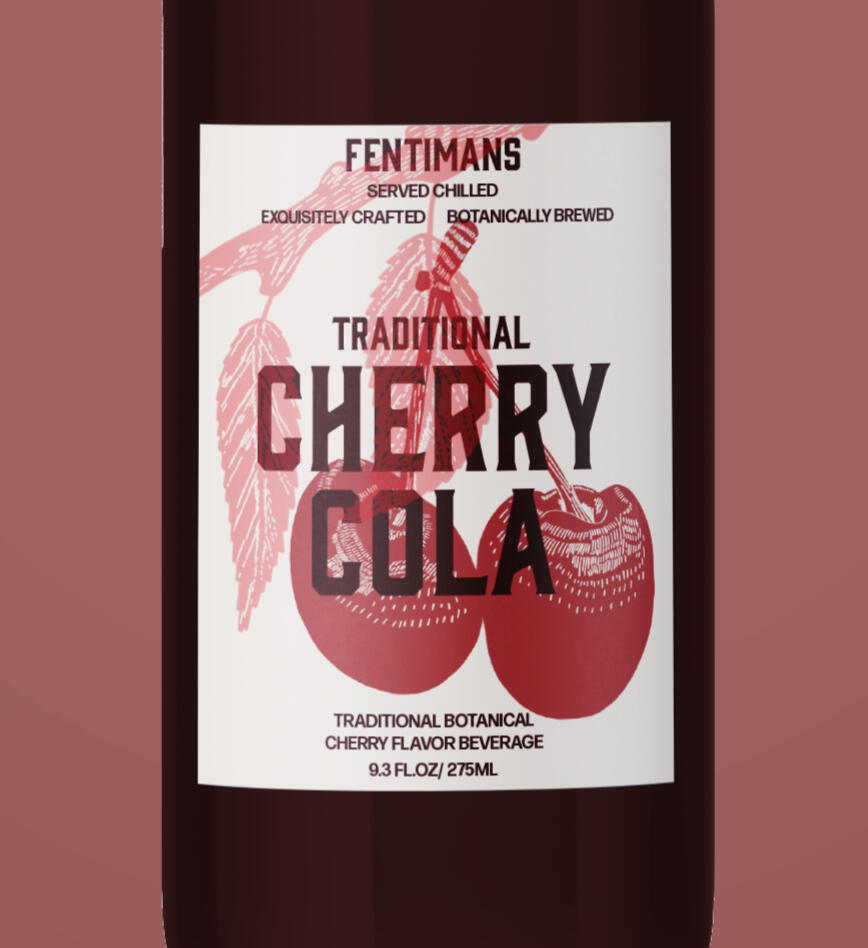
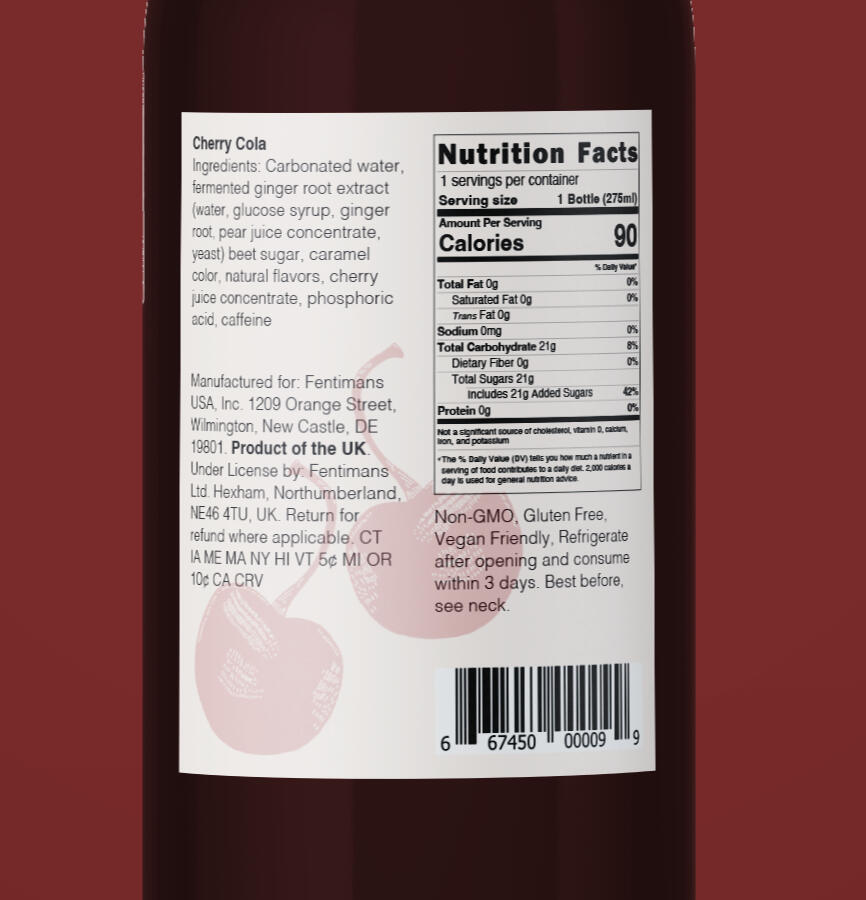
Fentimans Label Redesign
Spring 2024 - Label Redesign
A different look to the beloved Fentimans soft drink.
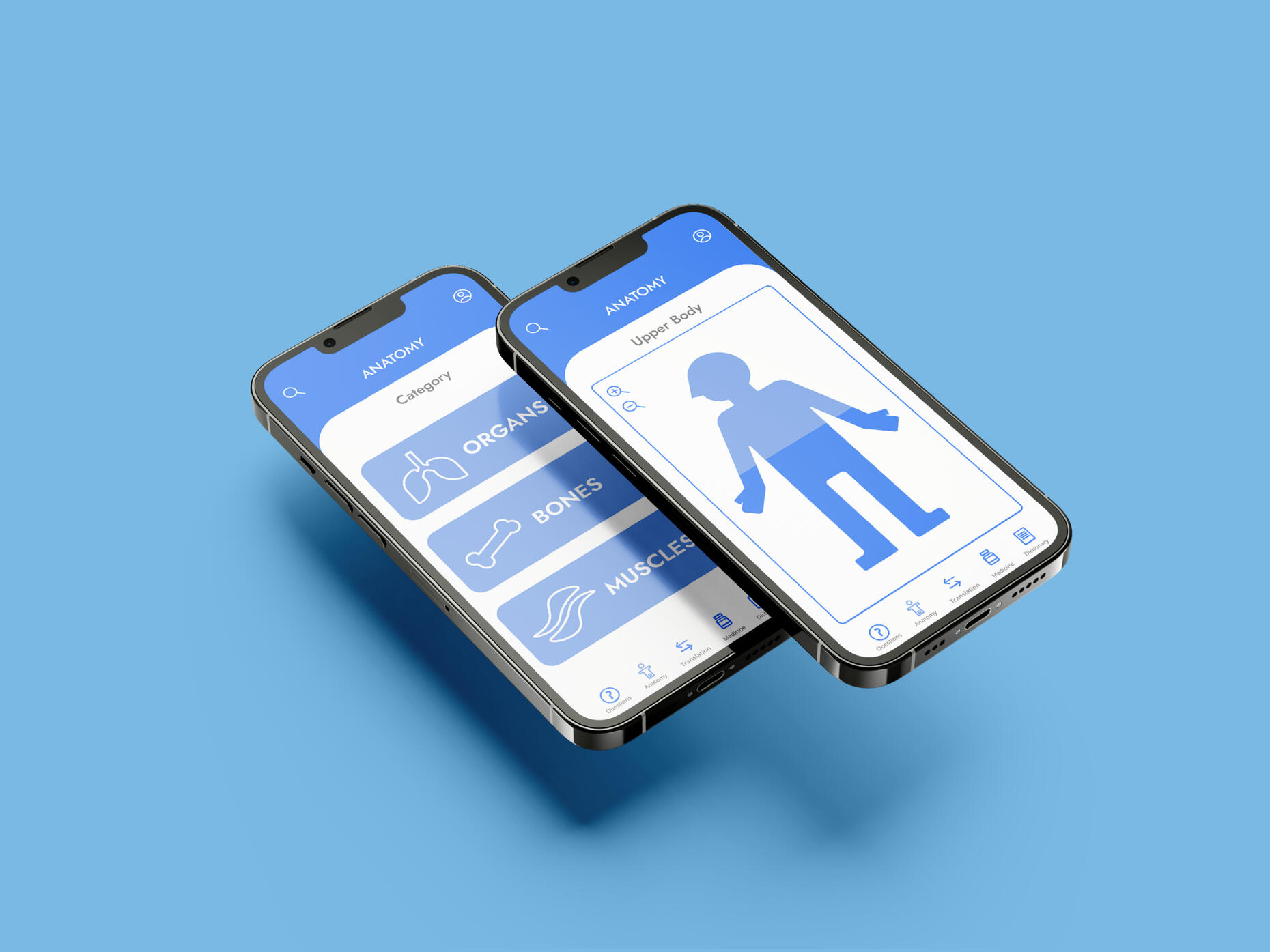
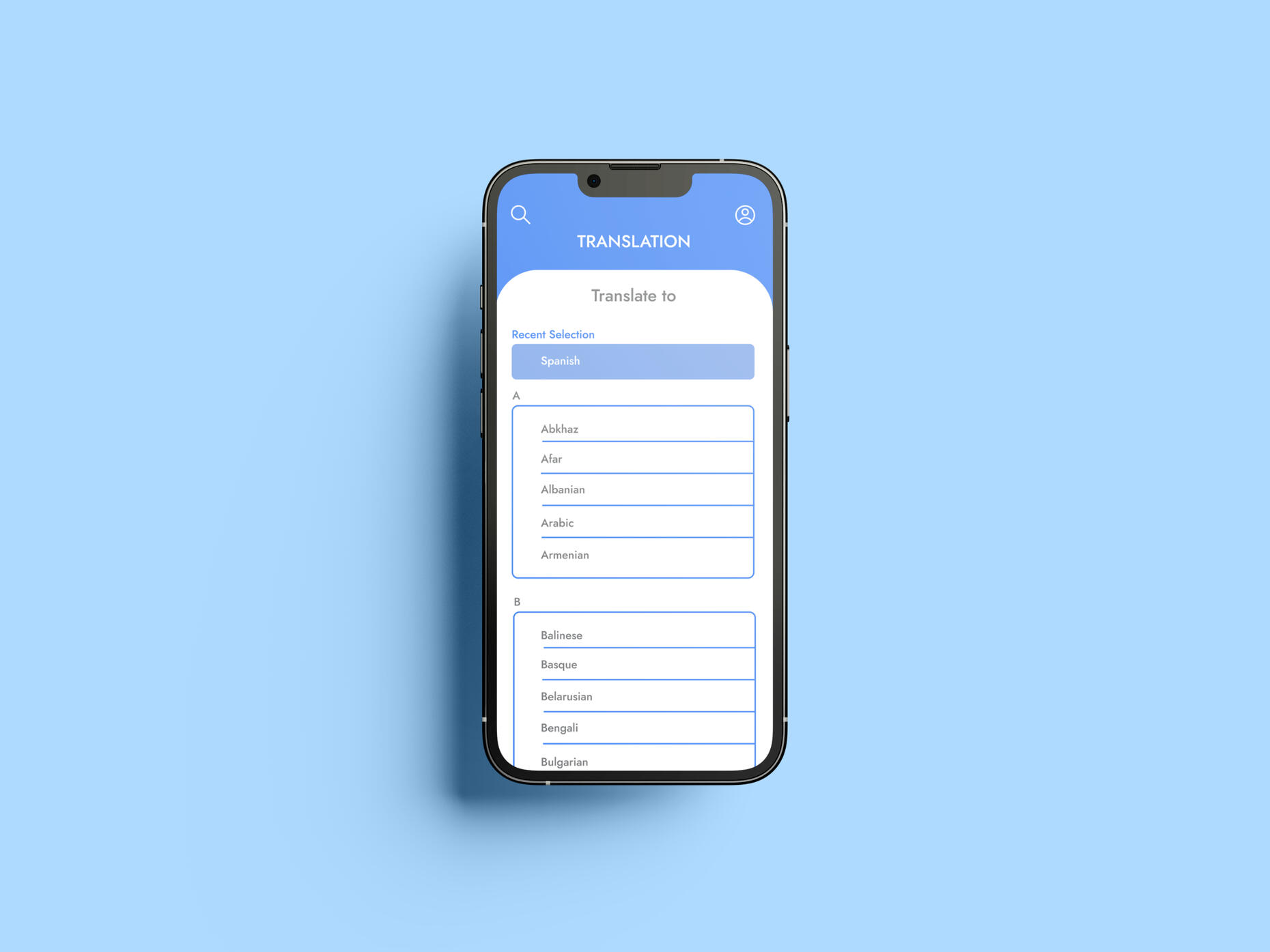
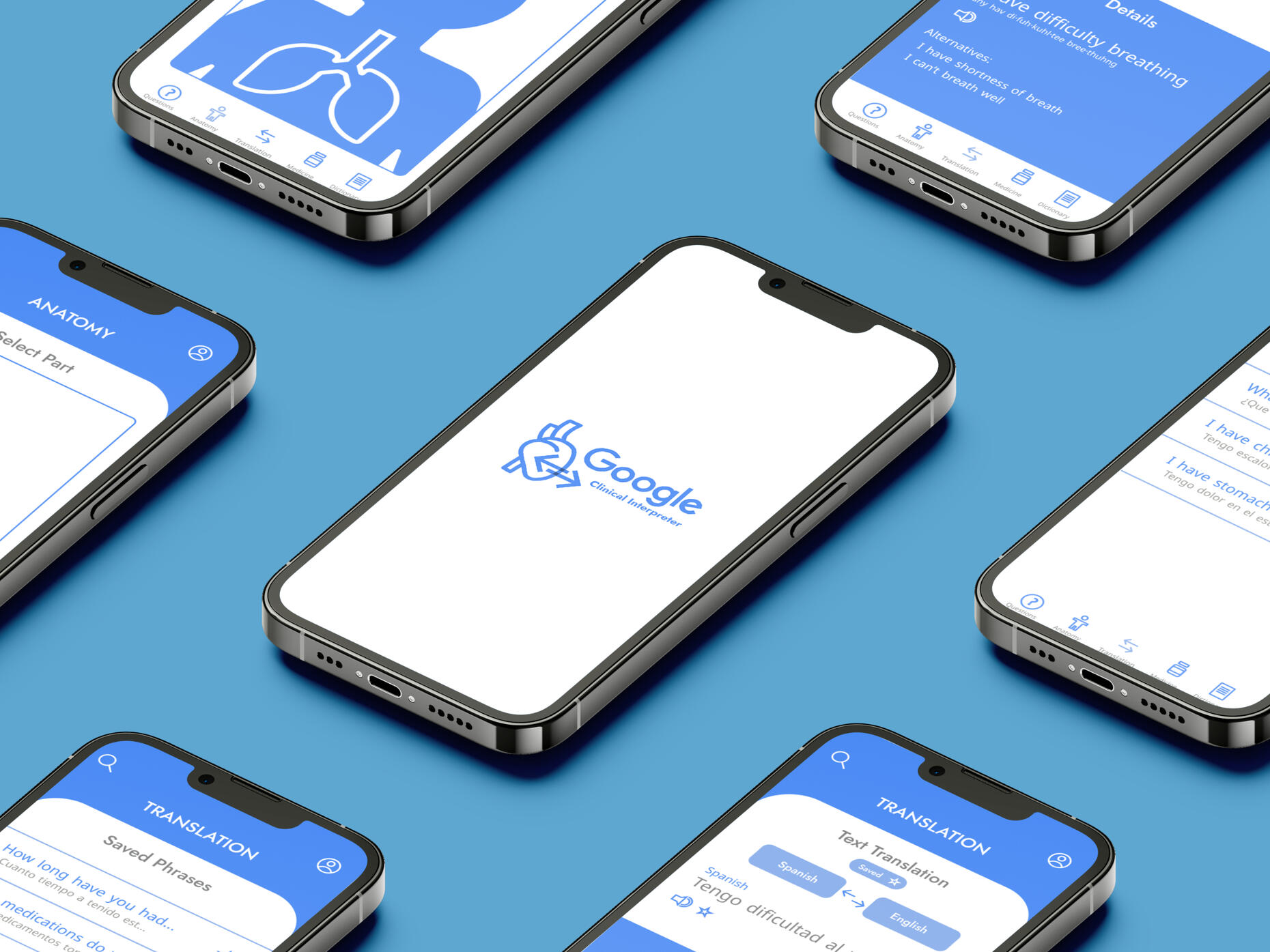
Google Clinical Interpreter Branded Purpose Driven App
Fall 2024
An extension of Google Translate for those in need of interpreting clinical words and phrases.

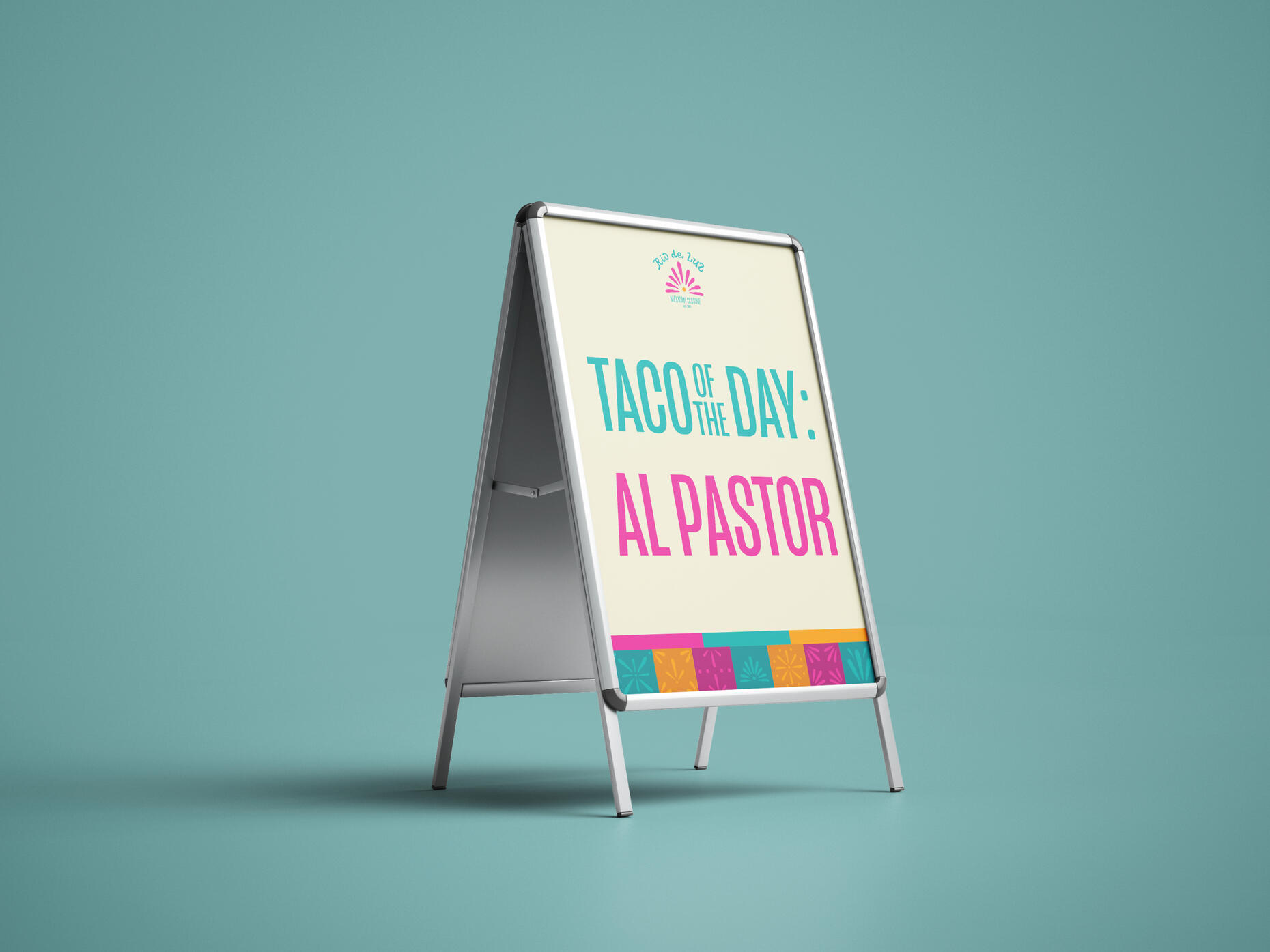
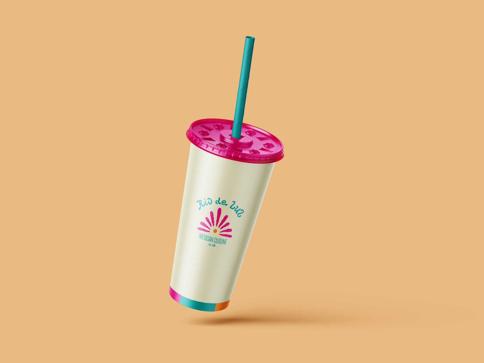
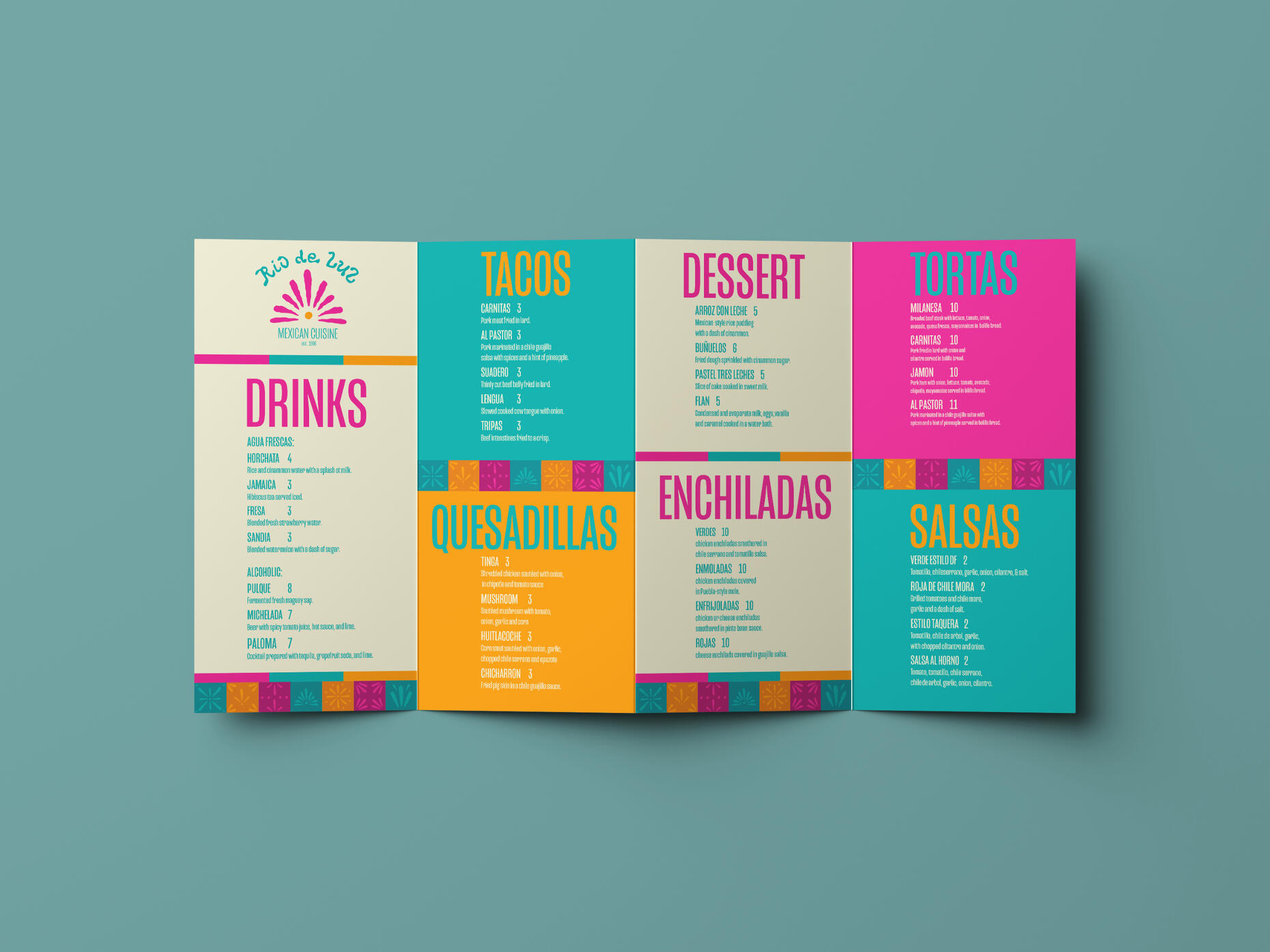
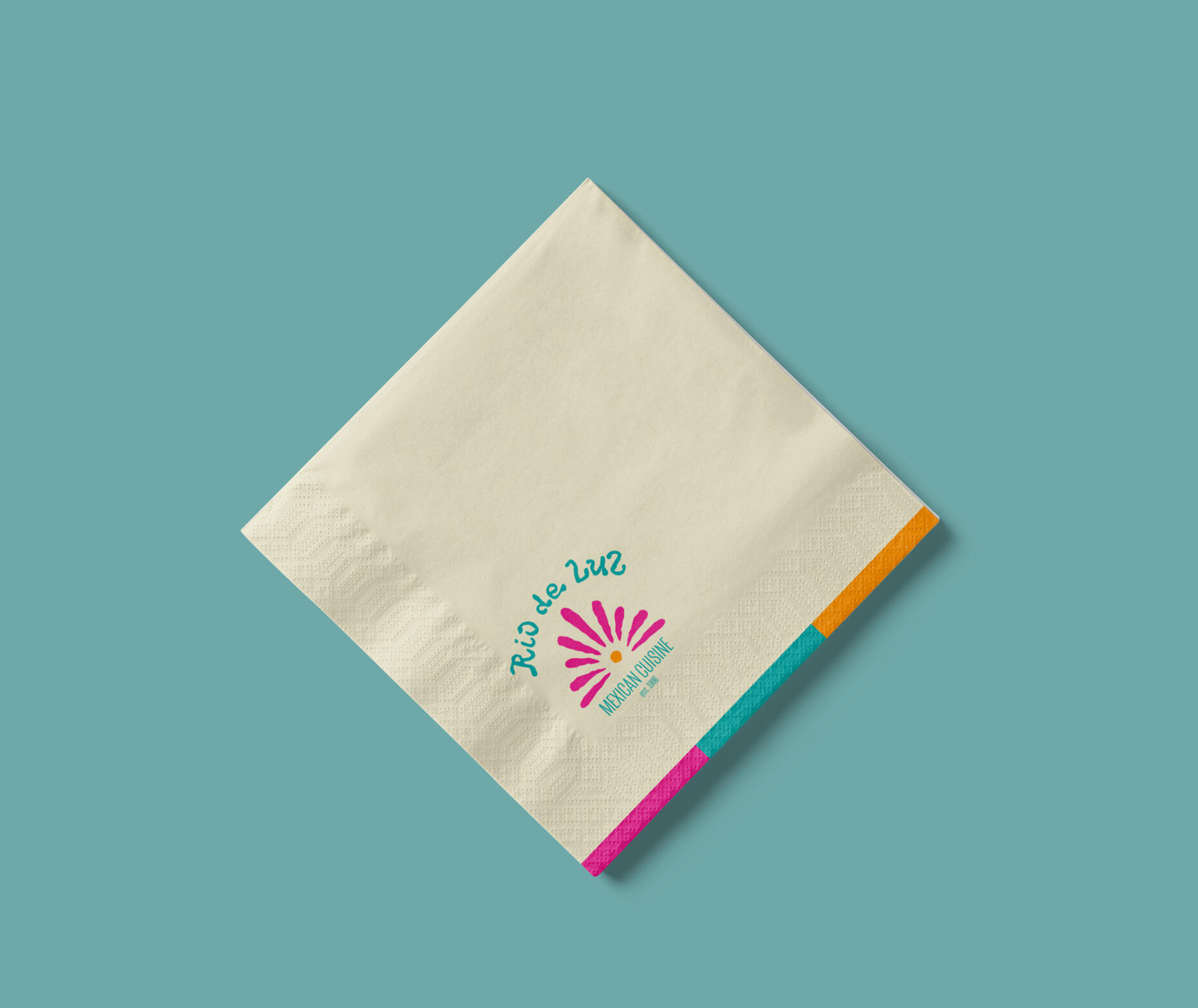
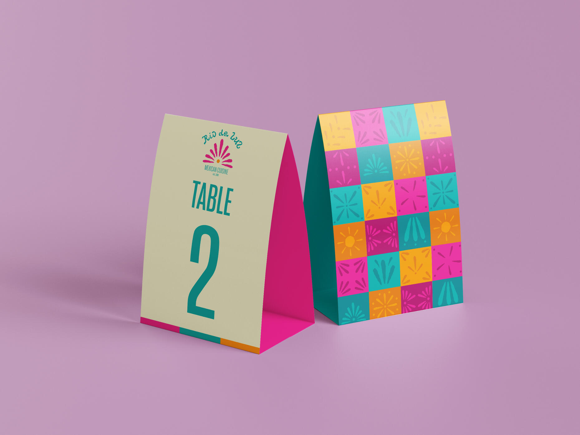
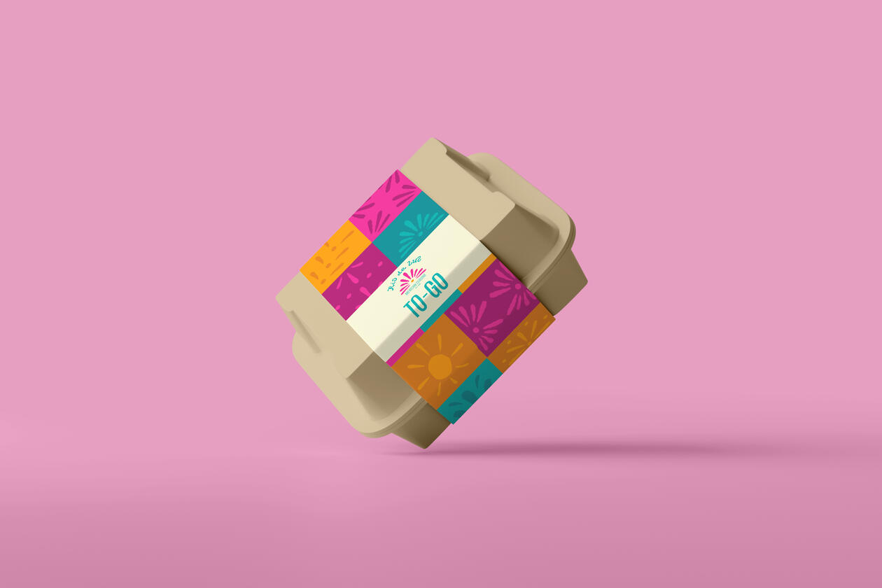
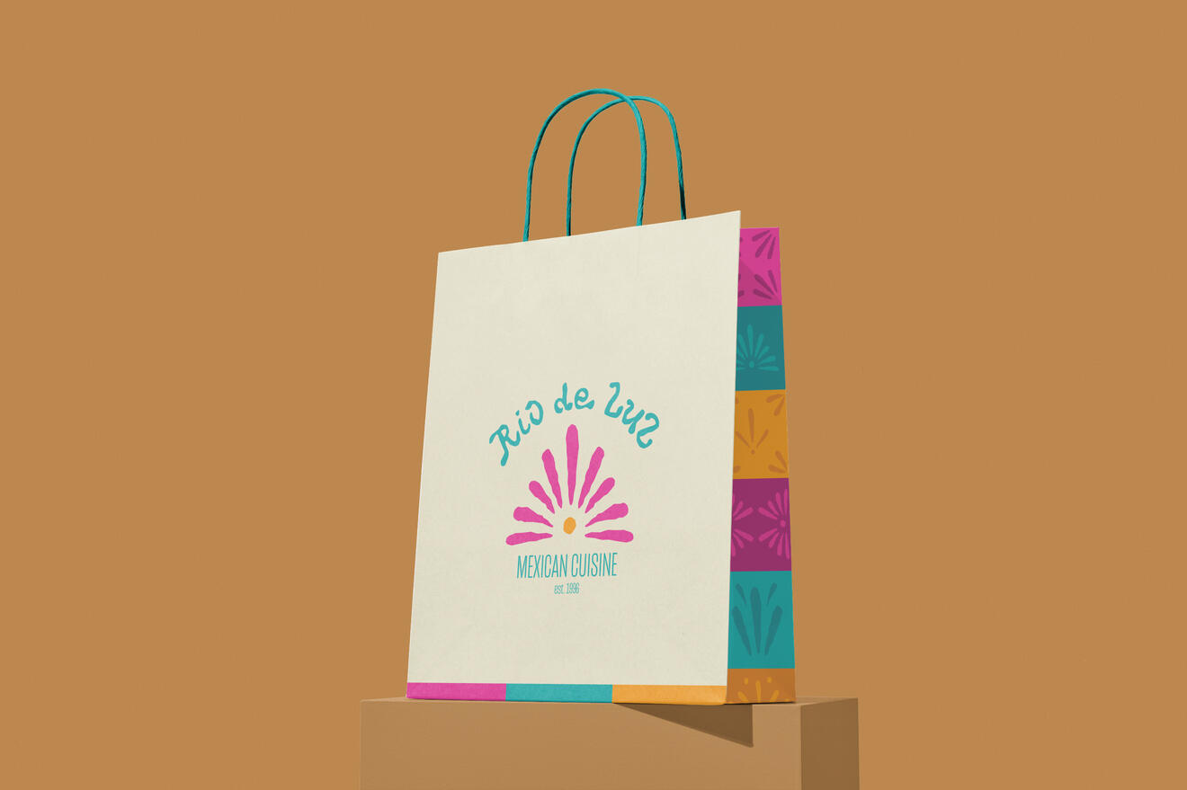
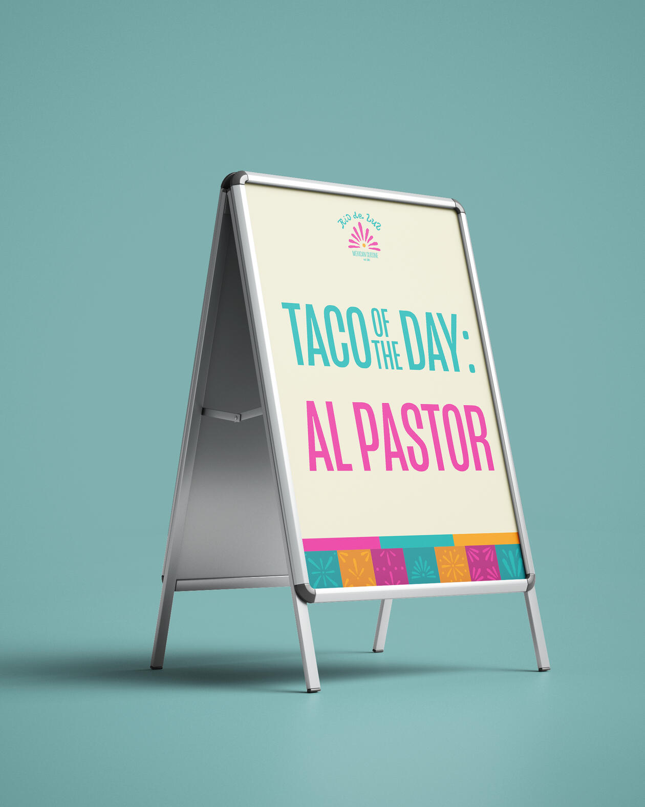
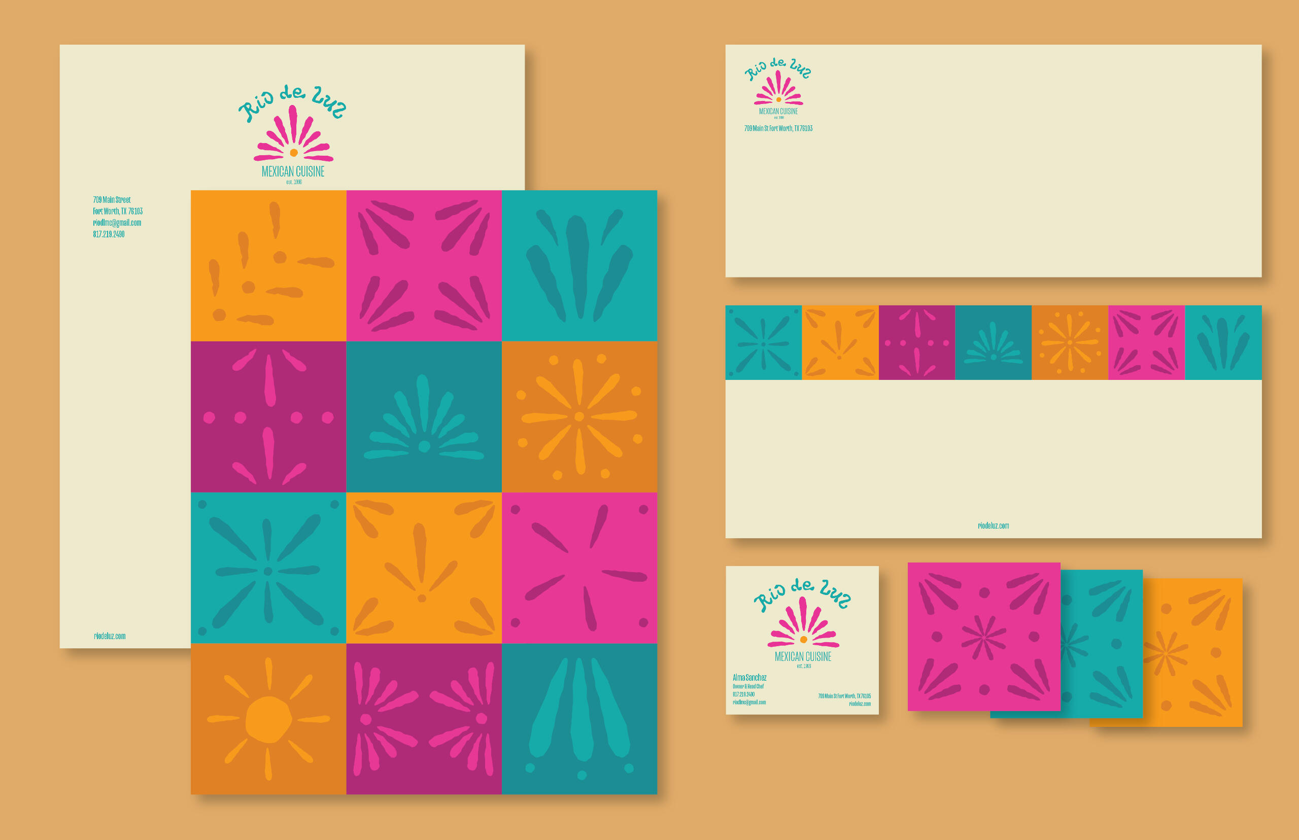
Rio De Luz Mexican Cuisine
Restaurant Brand Identity
Spring 2024
A Mexican restaurant with bright colors and handmade elements to represent the culture.
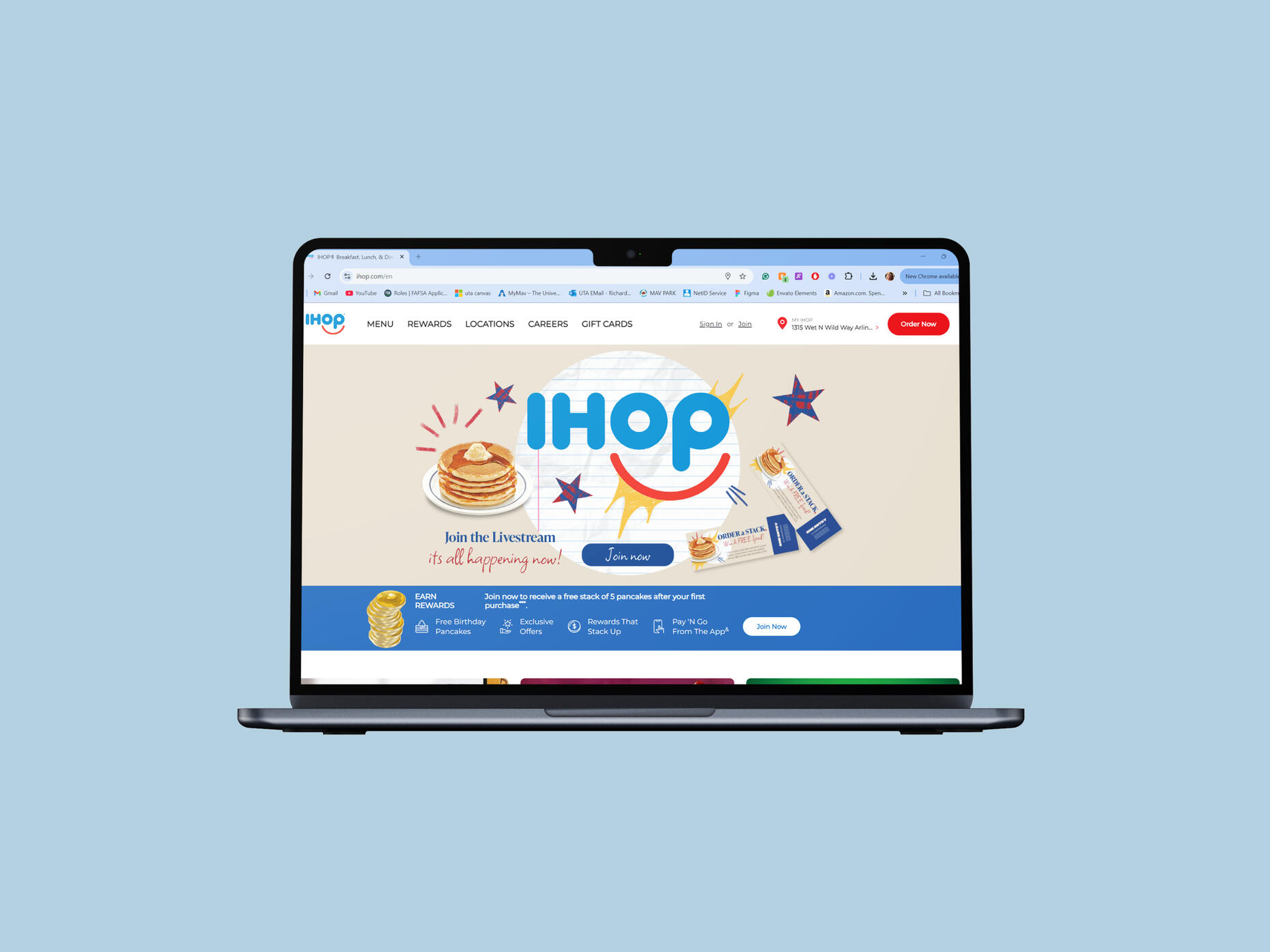
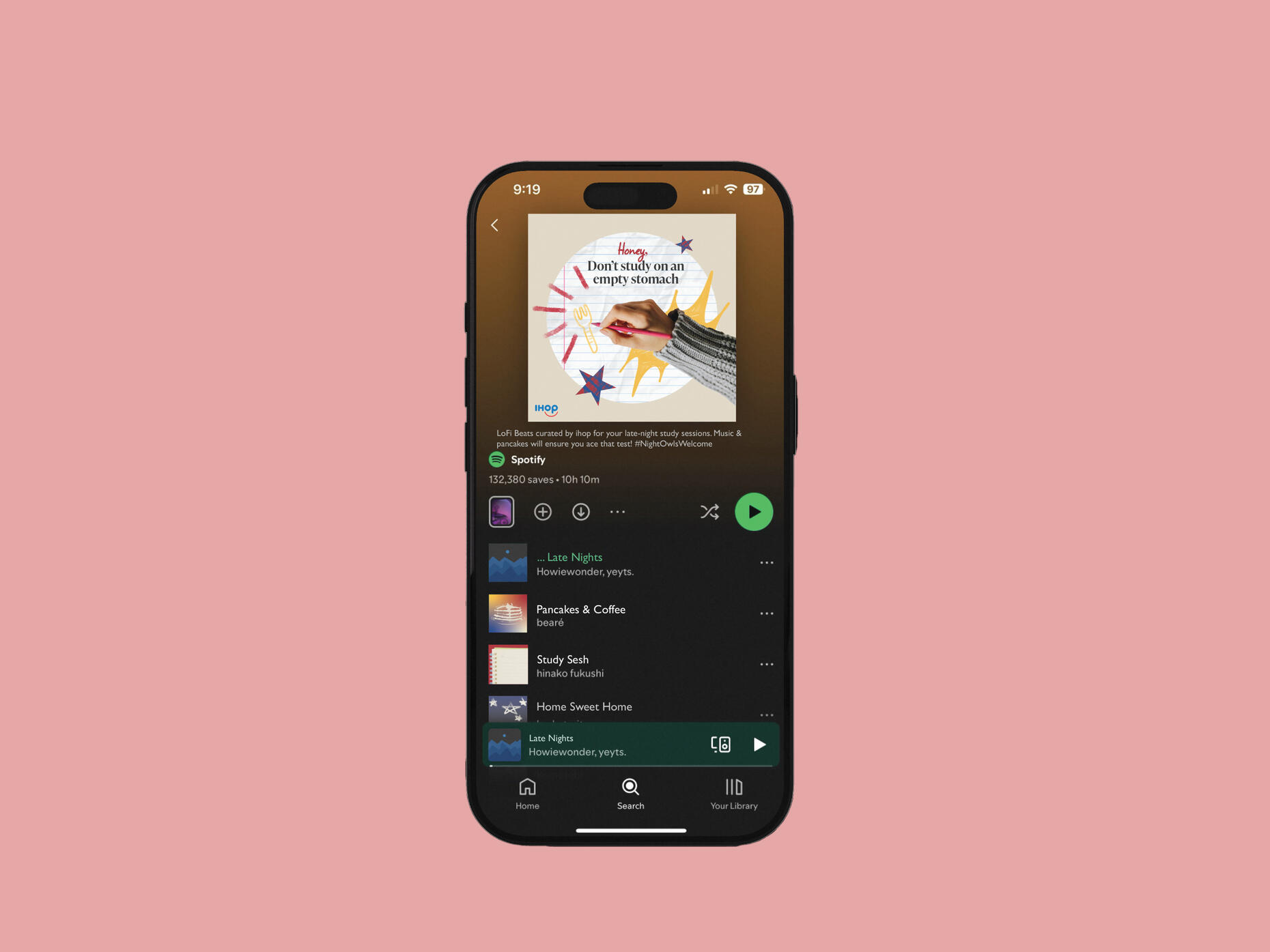
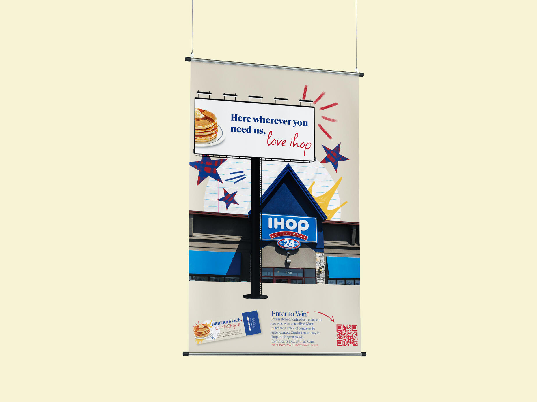
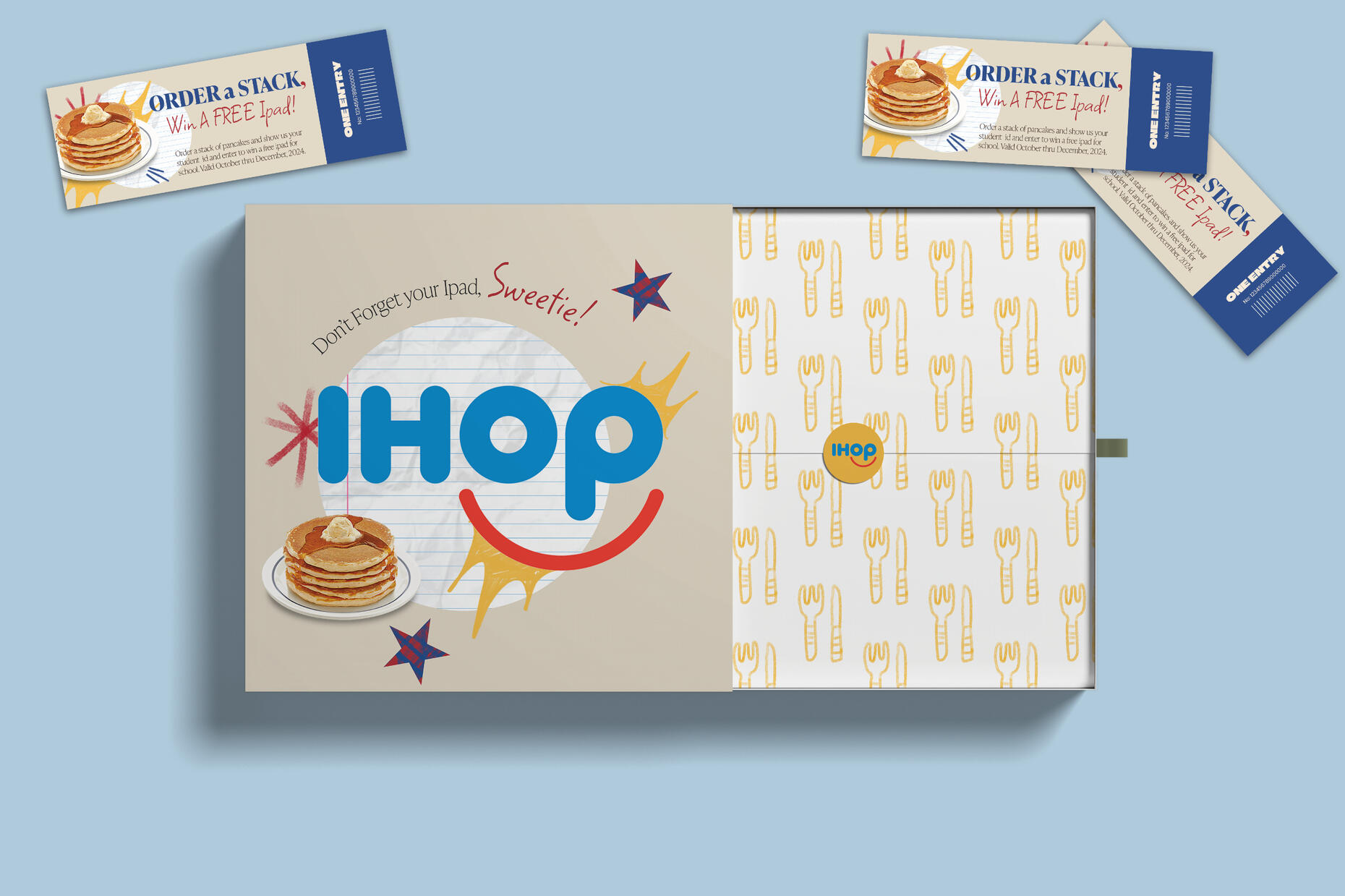
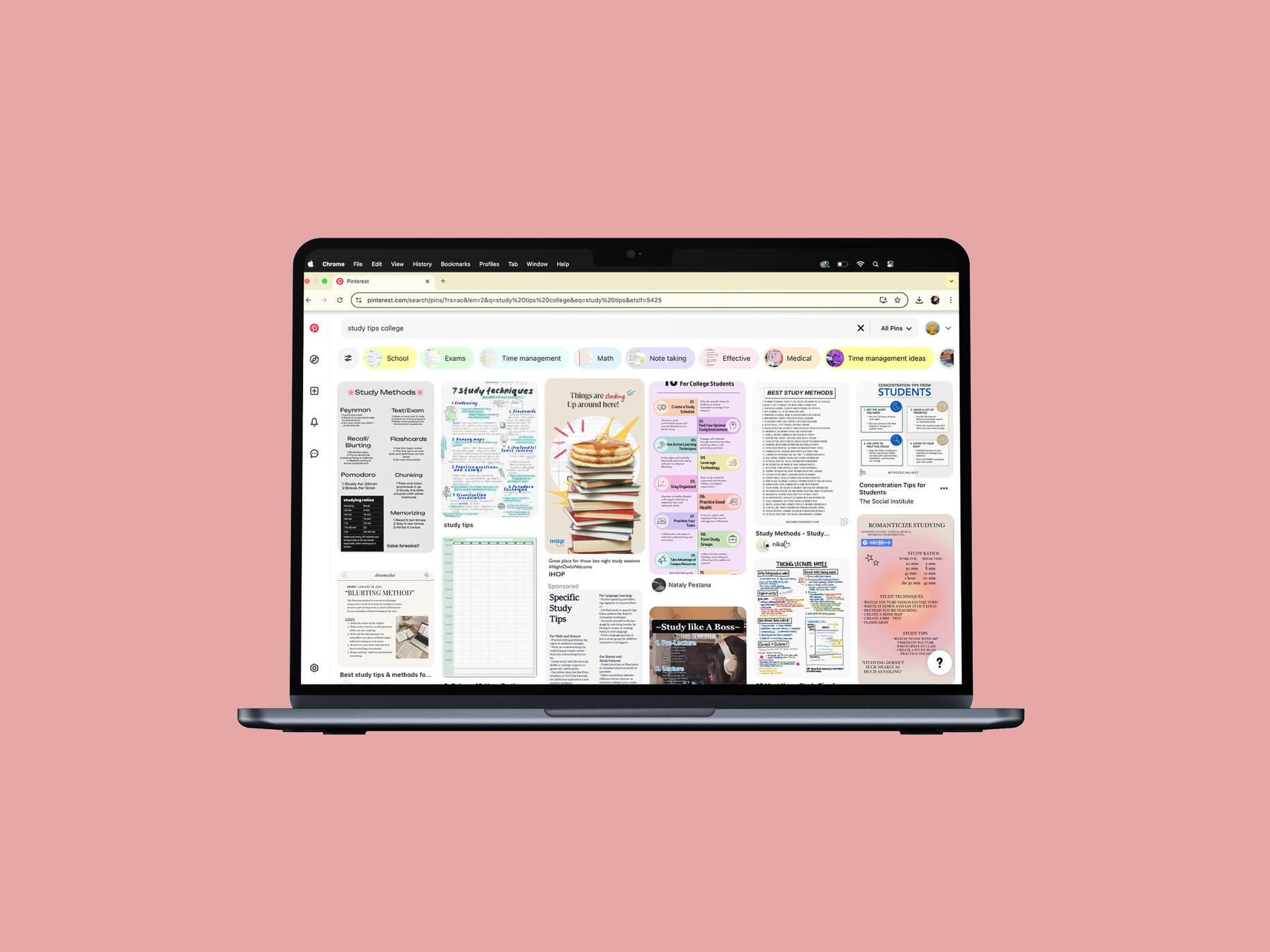
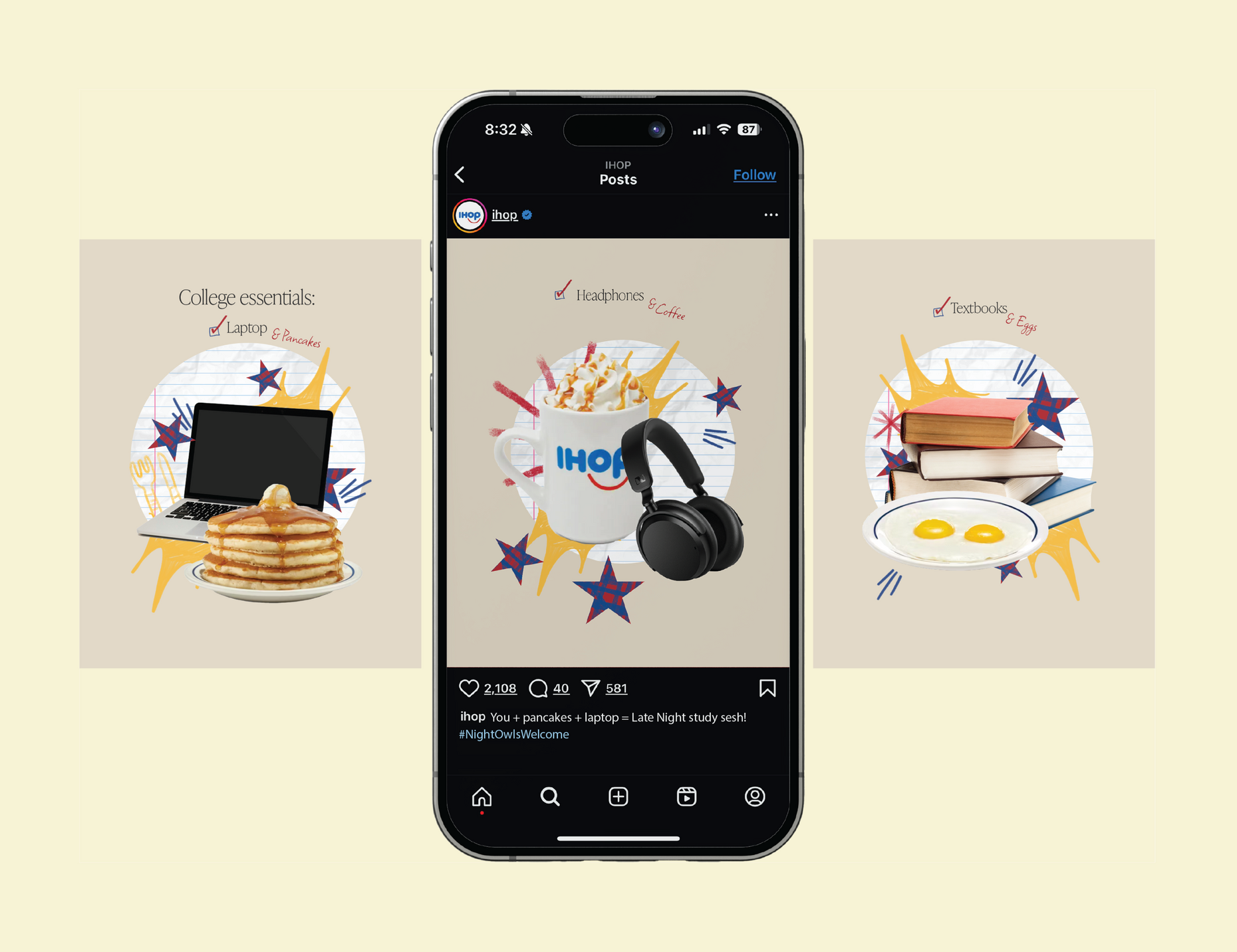
IHop Late Night
Advertising Rebrand
Fall 2024
Creating new take to IHop's audience.

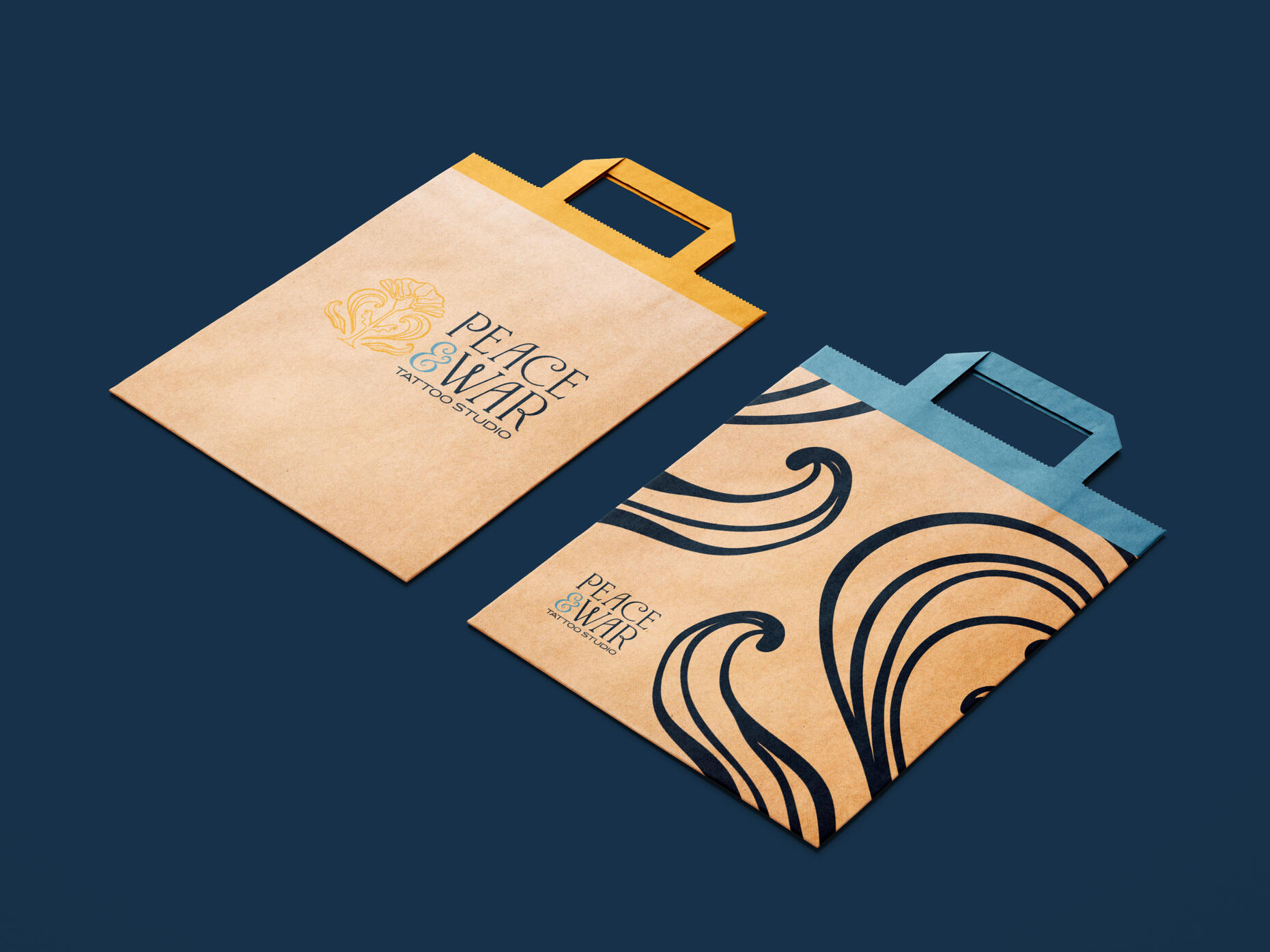
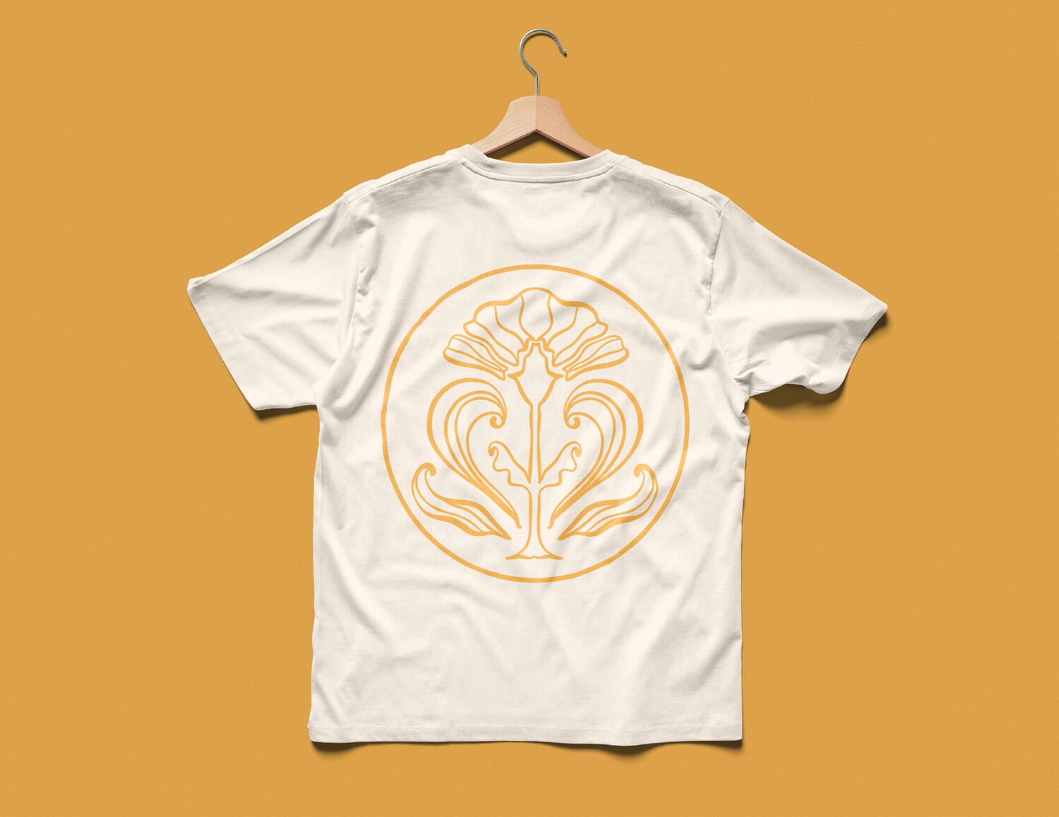
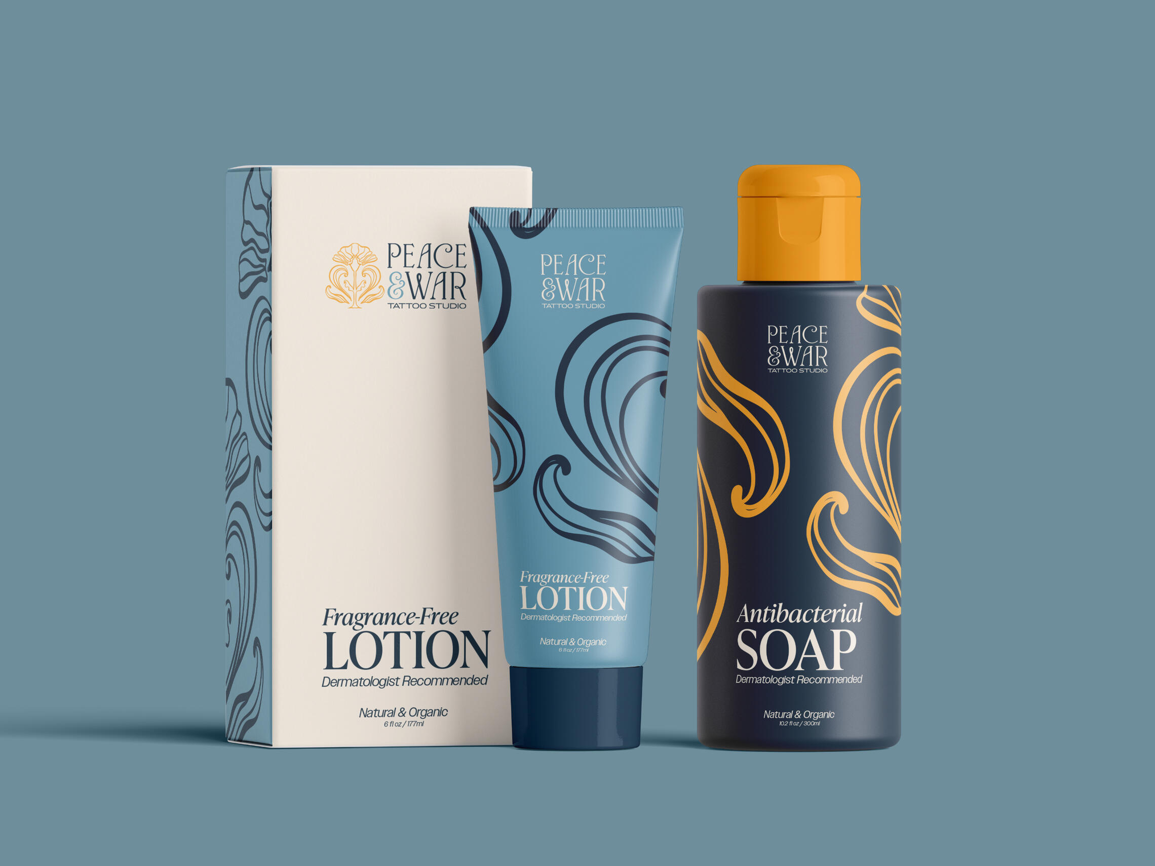
Peace&War Tattoo Studio
Spring 2025
Peace&War Tattoo Studio is located in Austin,TX. The elements of the brand are inspired by the revival of the art nouveau of the 60s. The concept was to introduce a more feminine aspect to a more stereotypical masculine institution. The colors of blues, yellow, and cream help create a delicate look.

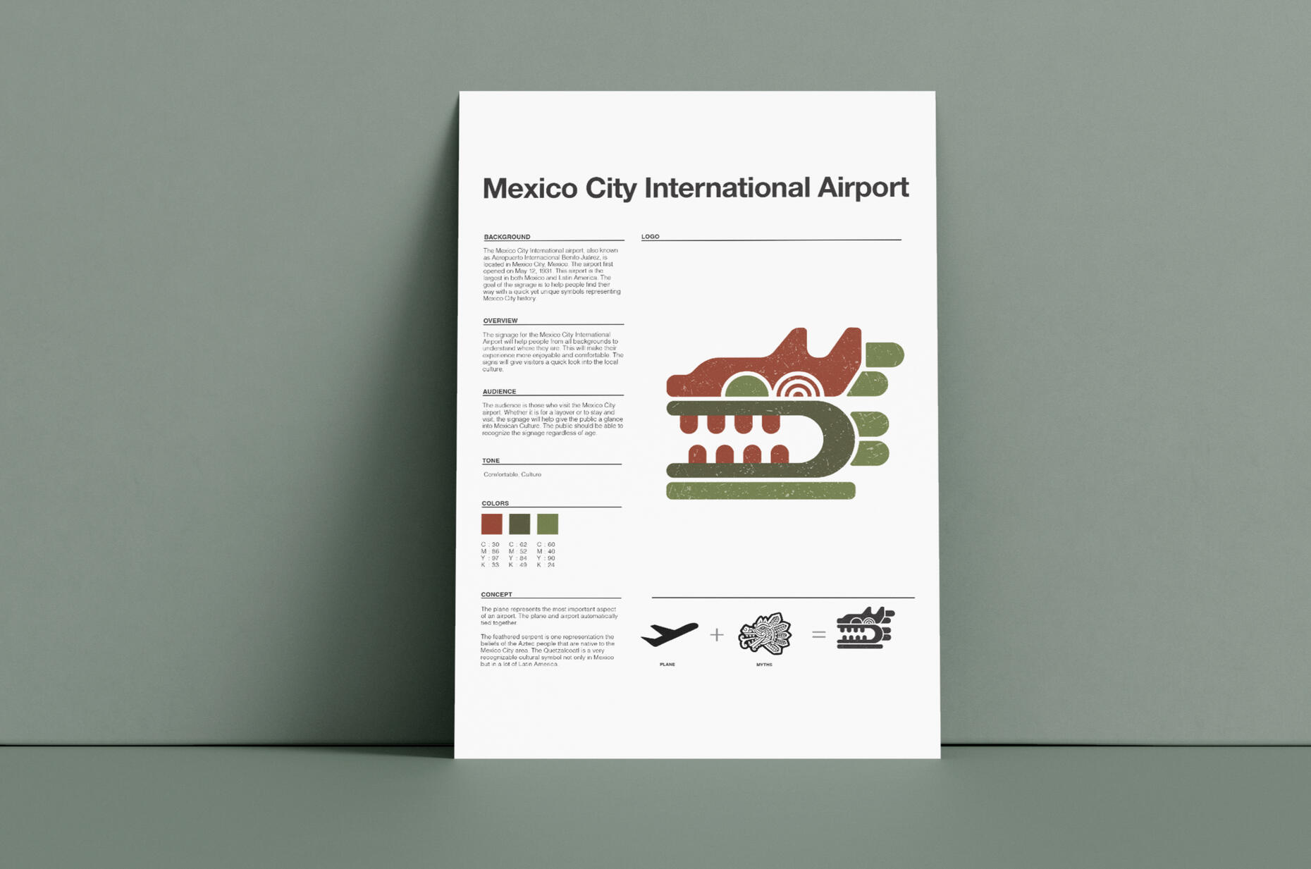
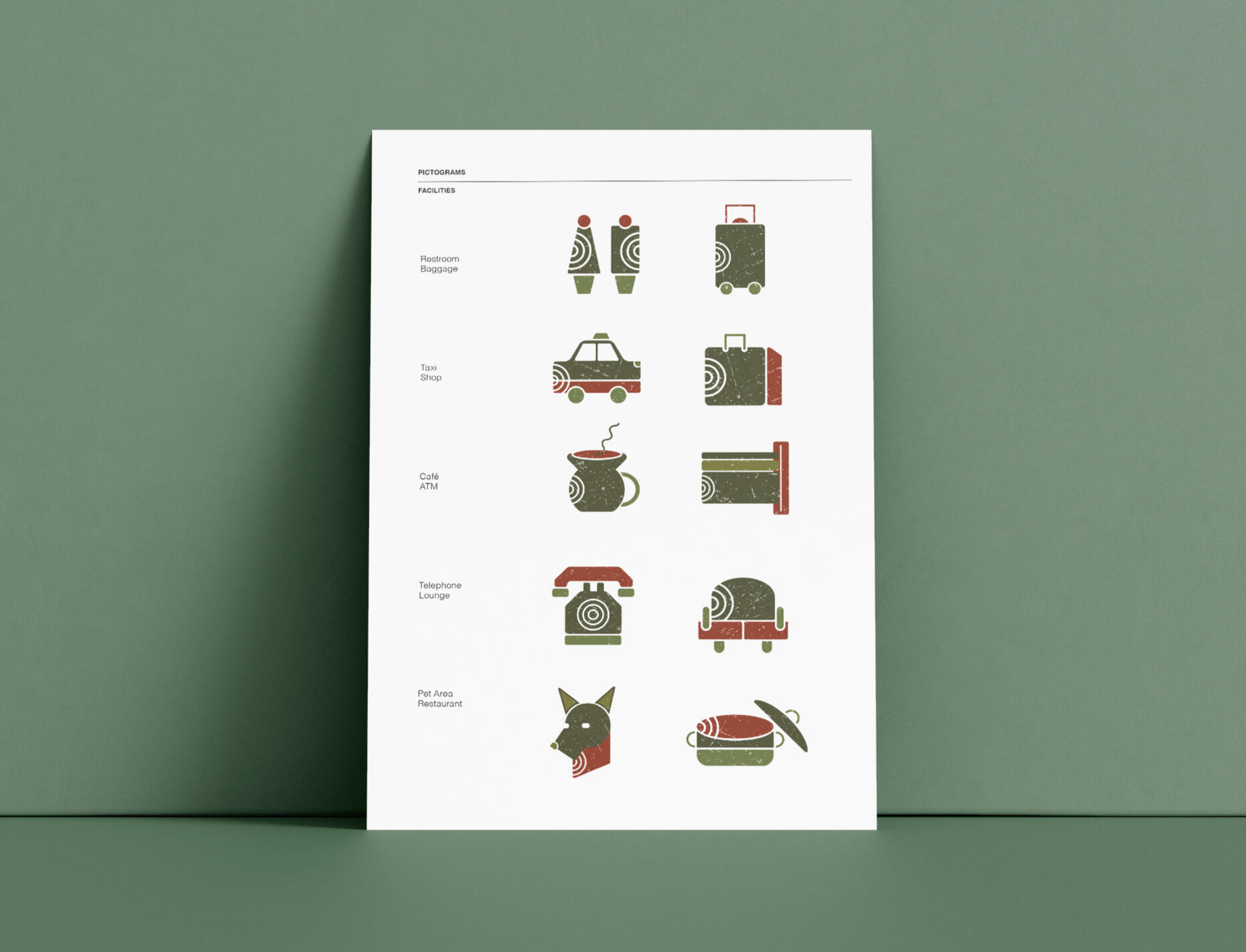
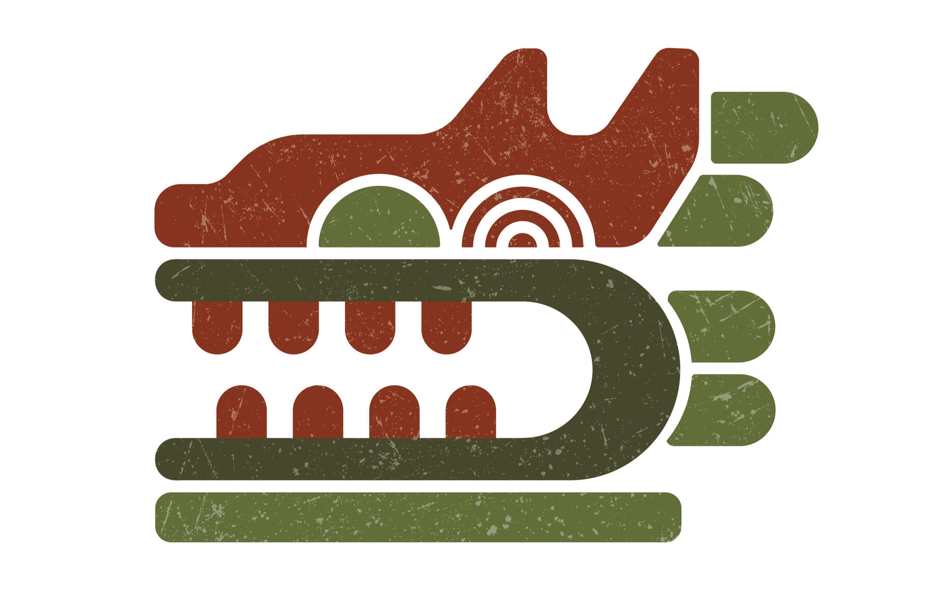
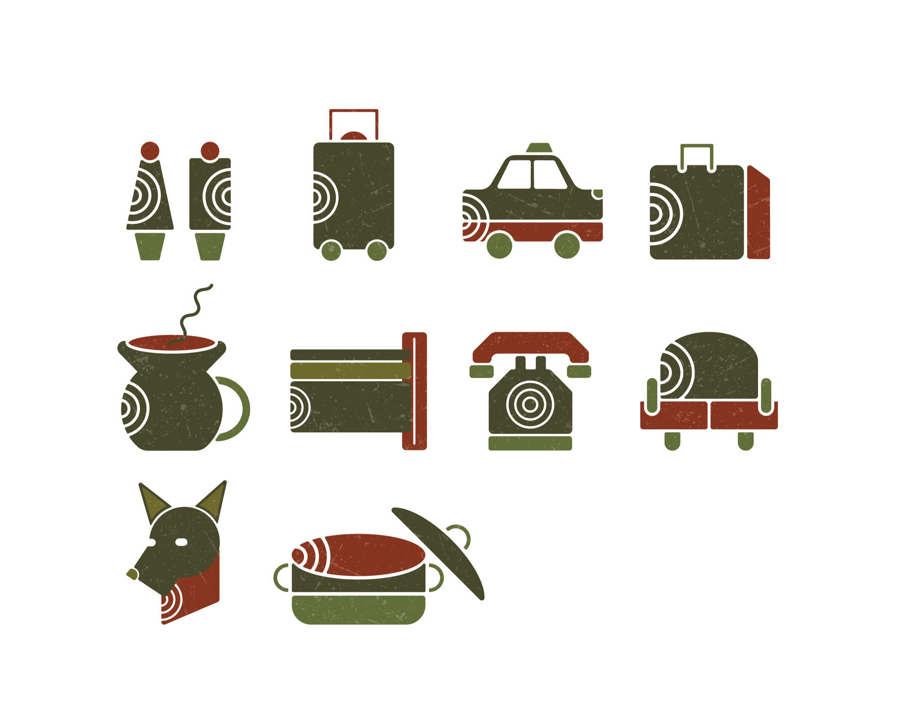
Mexico City Airport
Fall 2023
Student Silver AFF ADDY Award
This project consisted of creating a logo and way finding system for an already existing place. The key elements for the airport was to represent the culture of its location. The Quetzalcoatl which represents the culture along with a place were combines to create the logo. The muted red and greens are also something that is typically seen in Mexican culture, such as the flag. Aztec art also heavily inspired the half circle element.

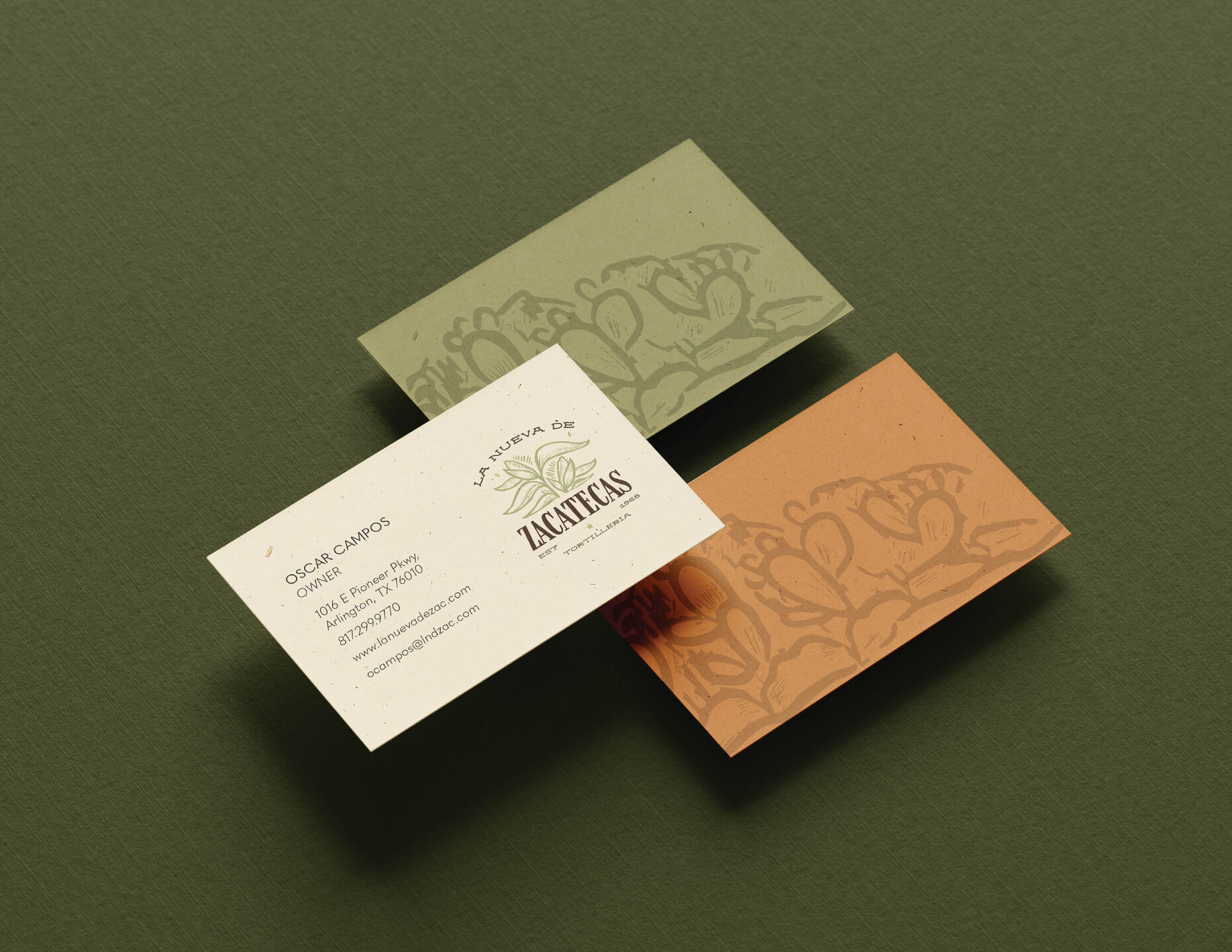
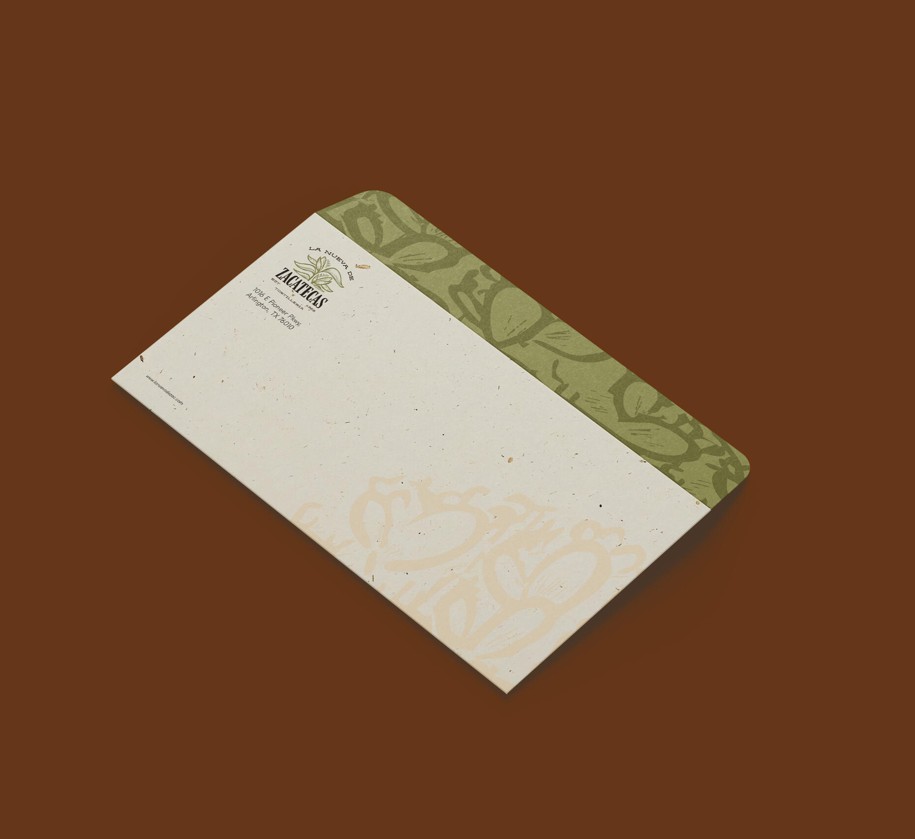
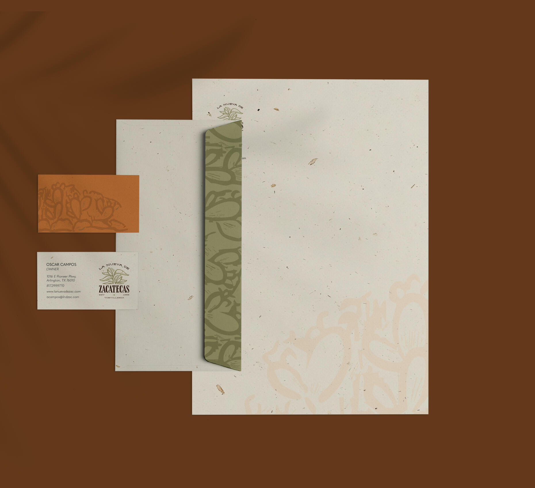
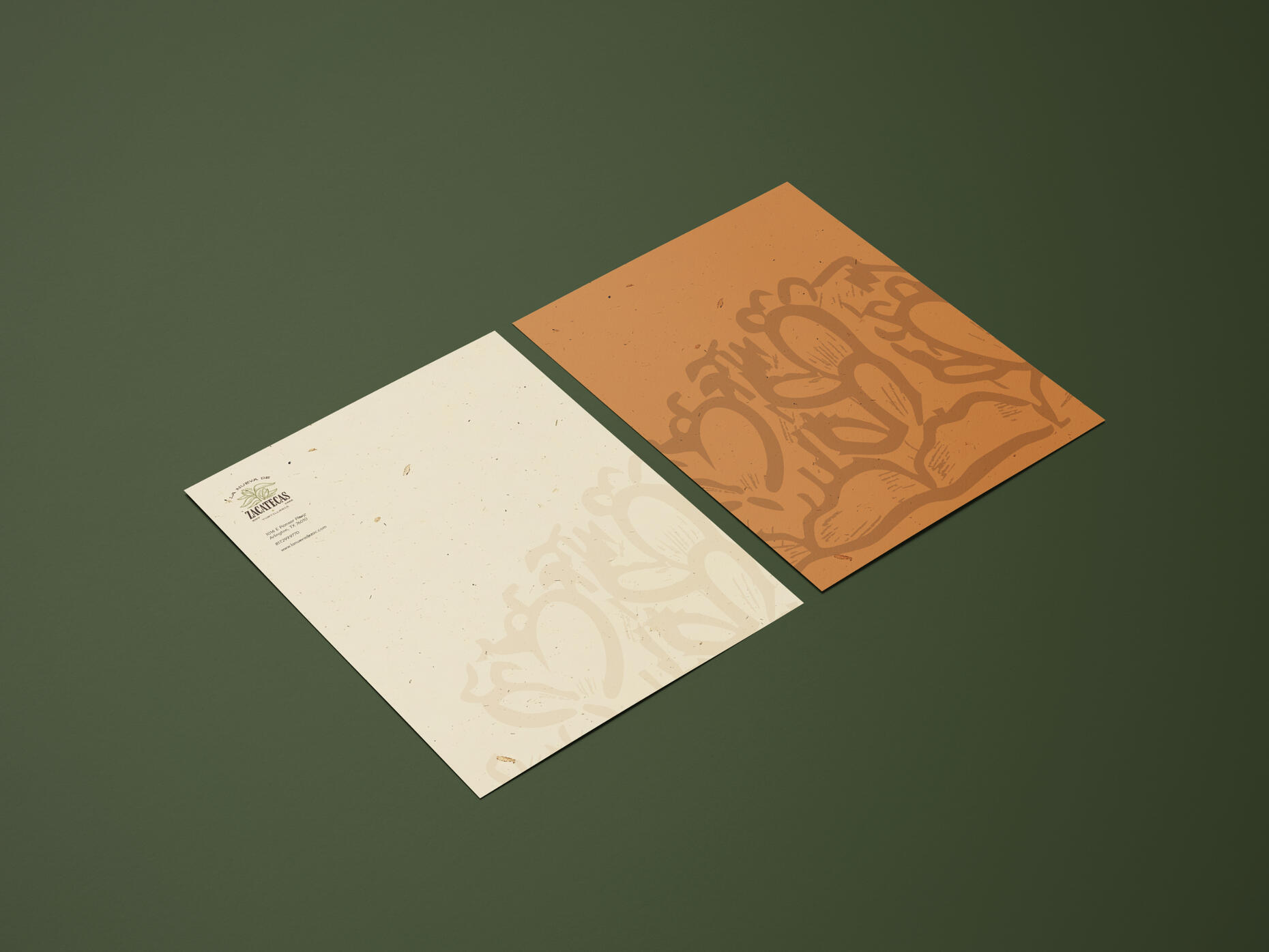
La Nueva de Zacatecas
Spring 2025
Based on an existing logo. This redesign consisted of recreating the logo and a stationery set. With this project creating a logo that told the story of the business was important. The corn is used to represent tortillas and the muted earthy colors helped tell the story of a old yet home-like aesthetic.
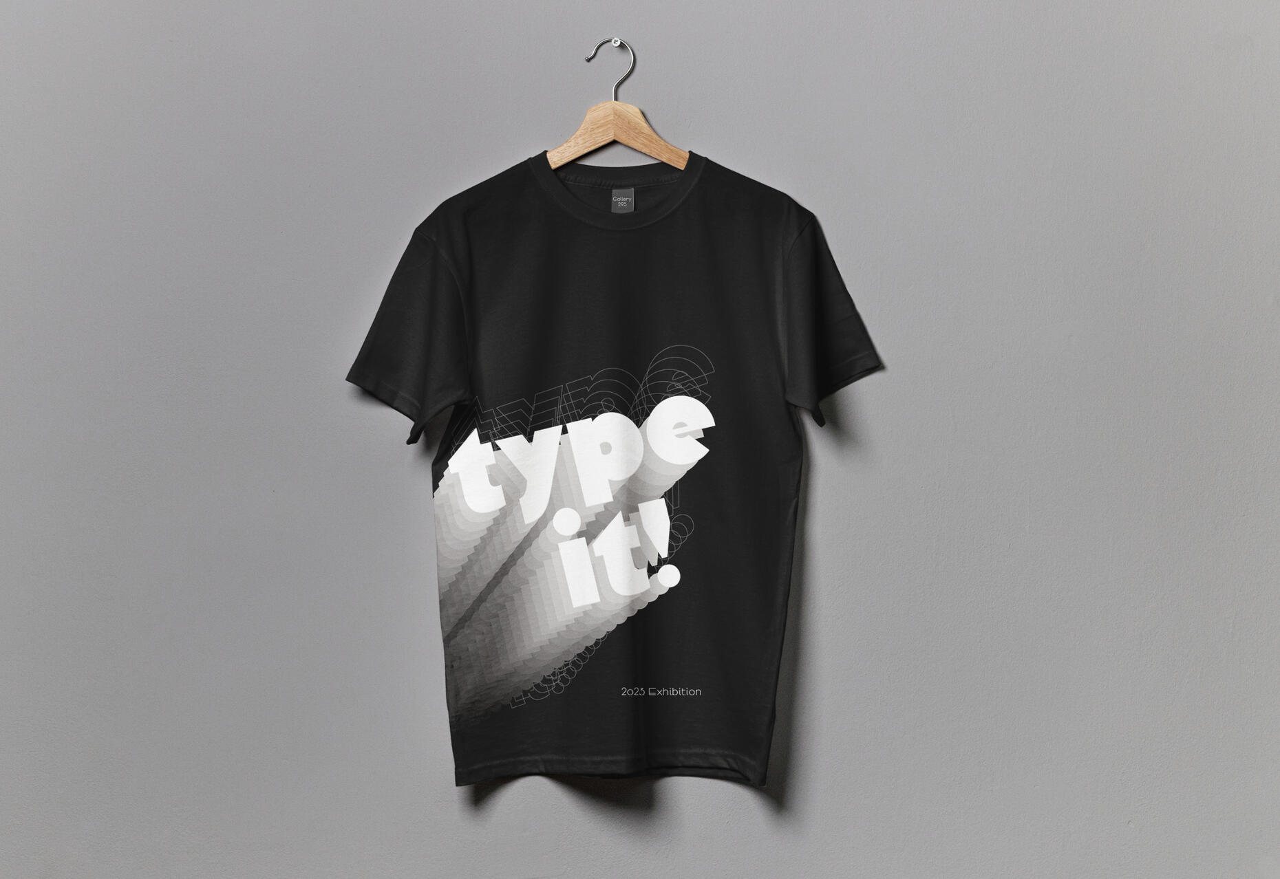
Type It!
Fall 2023
Type It! is a exhibition identity project which included a poster and ephemera. The poster allowed type to be the main focus. Since repetition is a major element is was key to use negative space in order to let the type breathe. The black and white color palette also helps create a minimal look which furthermore allows the type to be the center focus of the poster and deliverables.

Fentimans
Spring 2024
Fentimans label redesign aims to retell the story of already existing drink through a different perspective. The original label had an old-school look that was important to recreate. Creating an illustration that aligned with the flavors was important for the consumer to have a easier time choosing their drink. The soft toned reds also help portray a vintage look.
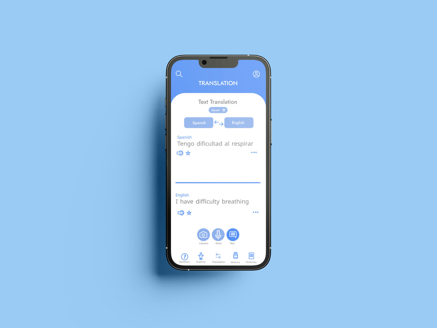
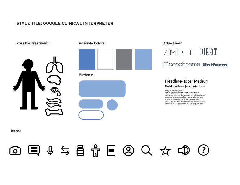
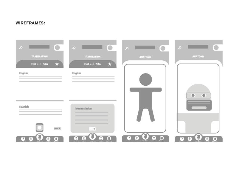
Google Clinical Interpreter
Fall 2024
Google Clinical Interpreter is an extension of an existing app. With this project is was key to keep a similar look to the original brand design. The minimal elements and color palette helped interpret the intricate message of the app into a more approachable layout. It was also key to have visual elements such as icons, as it is a universal symbol regardless of what language the user speaks.
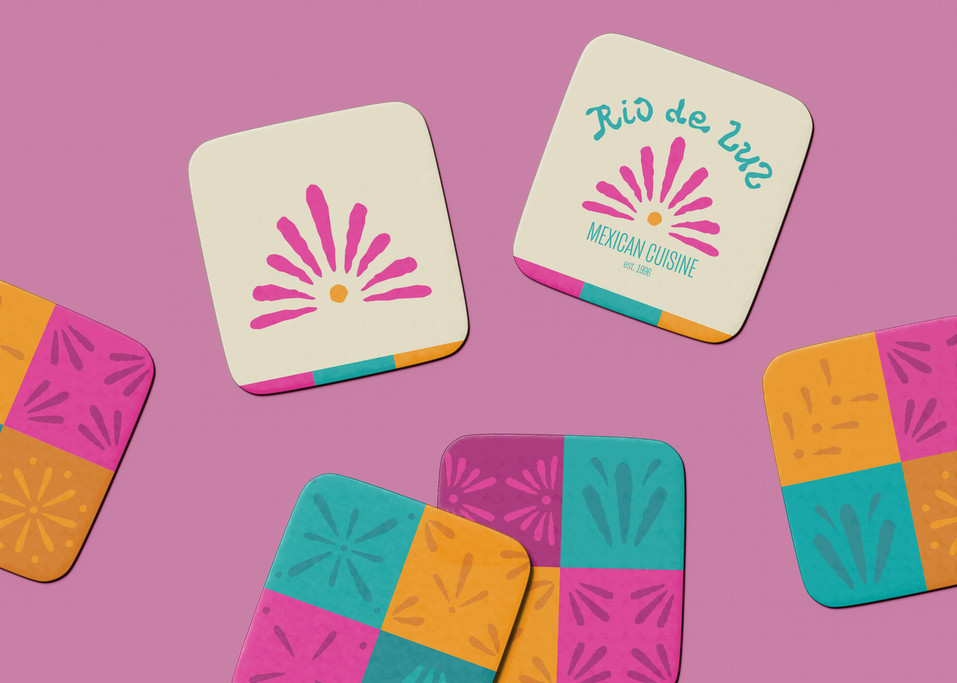
Rio de Luz Mexican Cuisine
Spring 2024
UDA Annual Int’l Design Student Bronze in Signs
The concept behind the project is to develop restaurant brand identity. This required a logo, stationery, menu, and ephemera. With this project the major concept was to depict Mexican culture by using bright colors and symbols typically found in the cultures art. The logo and other decorative elements have a hand made look which helped give the brand a home-like feeling.

IHop Late Nights
Fall 2024
Group member- Ali Richard
This project consisted of rebranding a well know establishment with something completely different. IHop offers 24/7 service and who could benefit from this the most? College students! Our brightly colored and handmade elements give this establishment a fun and youthful look, for those students looking for a safe place to eat and do their homework

For as long as I can remember art has been one of my passions. My love for drawing is something that is constantly referred to in my design work. Mixing illustrations and hand-drawn elements helps create a unique and personal look. Design is a great gateway to express my creativity and identity, from color palettes to type choices. Design has taught me to view art in a different way. Although the final outcome is vital, it is also important to enjoy the process of creativity. This has taught me to take initiative, to be imaginative, and most importantly to take a risk.